Alan Marshall, Bernadette Moglia, Alice Savoie
This artice first appeared in La lettre en Europe on the occasion of the AEPM conference in 2012. Now sold out, it is reproduced here with the kind permission of the publisher, EMCC.
Typography, from the cradle to the grave
Typography: behind the apparent technical simplicity of the word lies a double meaning. According to the dictionary, it means the process of composing and printing text using movable lead type. But typography, freed by electronics and information technology from the burden of the lead characters of yesteryear, has taken on a much less physical meaning. Today, the term “typography” can mean the graphic presentation of a printed text, or a document in digital form. For a graphic artist, it is how thoughts and ideas are organised in all kinds of media: on paper naturally, but also on signage, packaging, shop-fronts … and of course on screens of computers, mobile phones, e-book readers and other tablets. For the ordinary reader, “typography” means the aesthetic impact of a page, book or document, its legibility and readability (or otherwise). Thus the term “typography”, which could have fallen into disuse with the arrival of information technology, left at the side of the road by the progress of the graphic industries, has instead taken on a less technical, more everyday meaning, one which is more personal, even private, for anyone who has ever typed on a computer keyboard. The word now indicates a graphic universe which is immediate, palpable and omnipresent, of which every one of us is conscious through the flood of printed material in which we swim from the cradle to the grave: from birth announcement to death notice, from cinema ticket to restaurant menu, from electricity bill to train timetable, from advertisement to magazine or book. Typography is one of the key components of visual communication which, over the centuries, has used the same tried and tested recipe: text and images of course, but also the white space needed to combine them into messages, pages or screens which make sense, ready to be grasped by the brain, and to give pleasure to the eye.
The three pillars of typography
The history of typography is essentially based on three fundamentals: one technological, the second aesthetic, and the third cognitive.
Born in the fifteenth century, typography is closely linked to Gutenberg’s invention, and followed the development of printing techniques up until the dawn of the digital era. Let us recall that Gutenberg did not invent printing; it was in use over five hundred years earlier in the Orient, where text and images were printed from woodcuts. But the typographical process invented by Gutenberg was a revolutionary technique for the reproduction of books, radically transforming access to knowledge and turning Western thinking upside-down. Before Gutenberg, producing several copies of a text involved copying it by hand – as monks did in their scriptoria. To reproduce an image it could be cut into a wood-block to be printed in multiple copies. Gutenberg’s revolutionary idea was to mass-produce lead types which could be combined (printers say composed) to create a text in relief which, once coated with a thick ink, could transfer the words on to a sheet of paper as many times as desired using a printing-press. From 1470 onwards, typographical printing spread like wildfire from Mainz to Strasbourg, Venice, Lyons, Geneva, Bruges, Barcelona, London. The intellectual, political and economic force of printing would no longer be limited by frontiers or other barriers, apart from those which the religious and secular powers, nervous at such a spread of ideas, attempted to impose.
Detail of Gutenberg’s 42-line Bible. (Musée de l’imprimerie et de la communication grahique.)
In technological terms, typographical printing has not only been enormously successful, it has also been very long-lasting. It is often said that Gutenberg would have felt at home in a nineteenth-century print shop, where he would have found the employees using substantially the same methods as those he had developed four centuries earlier. Indeed, for over four hundred years, lead type, composing sticks and type-cases were everyday items to a printer. But from the end of the nineteenth century a series of technological innovations – mechanised composition, the typewriter, dry transfer lettering, photocomposition, electronics, IT – have massively speeded up the pace of change in typographical composition techniques. One after another, these technologies have heralded the coming of an information-based society which continues to evolve almost daily. Today, between a father and son, both professionals in the graphic media, a whole world of innovation has taken place, to the point that dialogue between generations is sometimes uncomfortable, as was the case not so long ago between printers and newcomers who had come into the trade via graphic design or information technology. These successive upheavals have forced typography to change, to redefine itself over and over again in order to hold its own and to maintain its role as messenger and witness of the age.

Letterpress poster, Lyon 1846. The word ‘Maison’ is set in display type from the Laurent & Deberny typefoundry, Paris. (Photo: Musée de l’imprimerie et de la communication graphique.)
In aesthetic terms, changes have often been as rapid and confusing as technological developments. There is a world of difference between a nineteenth century poster, with its rigid, thick capital letters and absence of images, and an illustrated lithographic poster of the “Belle Époque”, or between a page from Diderot’s Encyclopédie and a twentieth-century technical manual. But how does the layout of the paper edition of a daily newspaper compare with its internet version? How can we find points of reference in a changing graphic landscape, when we ourselves, like sorcerer’s apprentices, operate in that landscape with our personal computers and the hundreds of fonts which they offer, and with our limited (or zero) knowledge of page layout?
From a cognitive point of view, the way we receive graphic communications has stayed the same for millennia. From cuneiform tablet to deconstructed fanzine and now to the computer screen, we interpret every page or document with the same cognitive apparatus: our eyes and our brain. This same apparatus has continued to control the way we read, even though the quantity of printed material in society has gone on expanding and evolving in terms of its organisation and presentation. For the forms of text – first handwritten letters, then type – have never stopped changing, evolving, surprising us aesthetically, emotionally, intellectually! This we take for granted with print media because printers, typographers and graphic designers have never been short of imagination when it came to thinking up new ways to present messages on a page. Likewise digital media, unlike traditional print media, offer new ways of reading. A “page” of digital media is of variable extent and is not always immediately visible to the reader. A digital text is often designed to be read discontinuously, from reference point to reference point, from hyperlink to hyperlink, travelling up, down and sideways within a large quantity of information. Once the initial surprise has passed, our brain copes with this very well and coordinates our hand and eye as we move about a complex graphic space.
Thus, in spite of the many major technological and aesthetic changes which have marked print’s five hundred year history, typography remains – and will remain for a long time to come – one of the foundations of graphic communication. Typography touches and moves us, over and above the technological marvels which in the end we disregard.
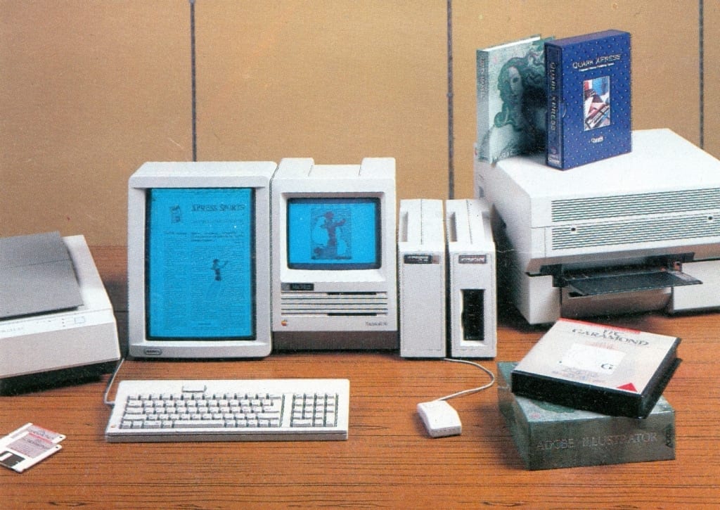
For many centuries typography was the exclusive domain of typographers and printers, as a result of the transmission of know-how from generation to generation, combined with an often heavy investment in machinery. The arrival on the market from the mid-twentieth century of inexpensive, easy-to-use typesetting devices opened up a new sphere of typographic production, essentially administrative and commercial, outwith the professional printing trade. The arrival of the personal computer and desk-top publishing in the 1980s took the process a step further, closing the gap between the public at large and the formerly craft-based and exclusive world of typography, creating a third sphere of typographical production, that of individual users. Each one of us, using his or her computer, selects characters, lays them out on the page, prints and distributes them. Whether amateur or experienced, a huge number of us have been caught up in typography’s nets, and from now on we have to think typography, to a greater or lesser extent, at a more or less personal level.
Why a typographical heritage?
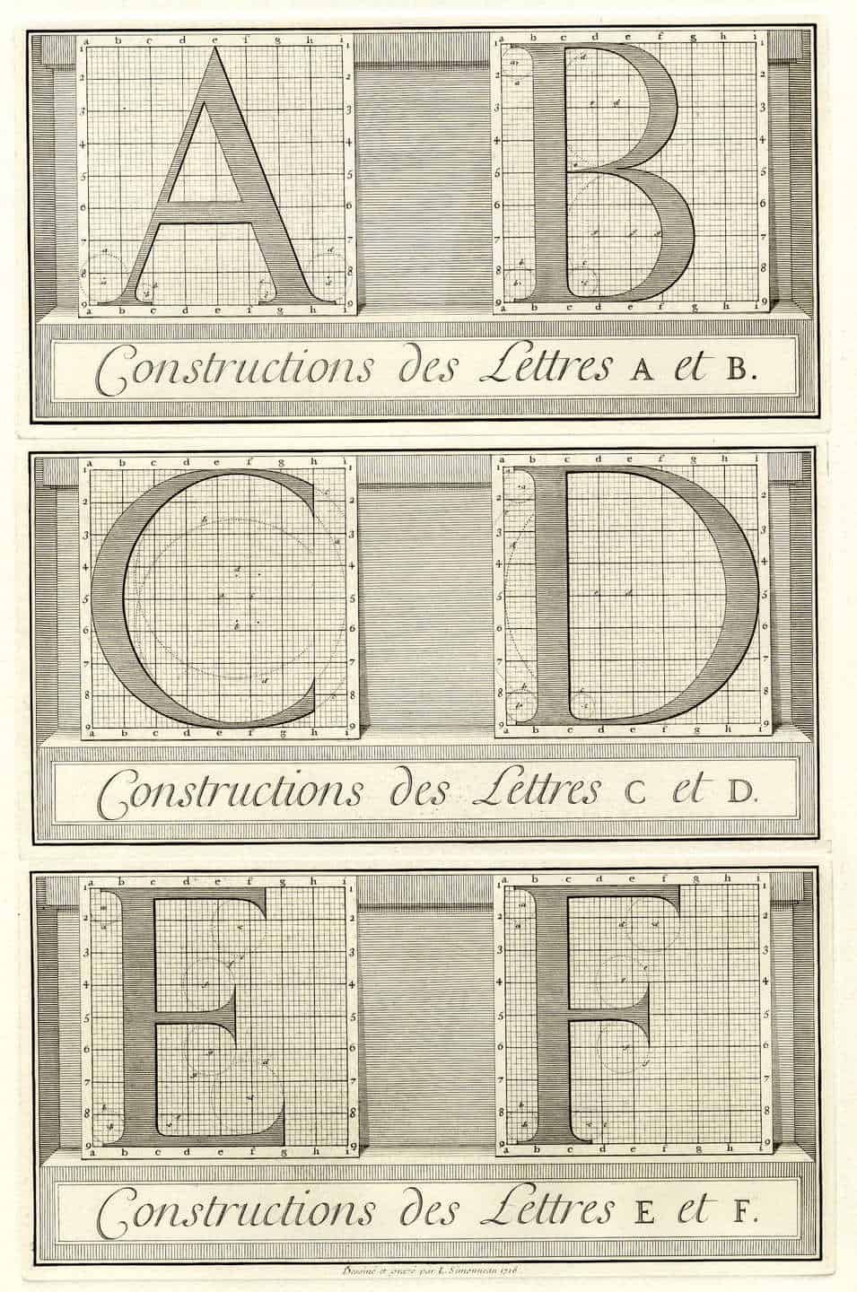
Study for the Romain du Roi printed from the original copper plates engraved by Simonneau and kept at the Imprimerie national, Paris, 1693. (Photo: Musée de l’imprimerie et de la communication graphique.)
The idea of a typographical heritage begins, by definition, with Gutenberg and the invention of typographic printing, earlier periods belonging to the heritage of writing or engraving rather than to that of typography. While the punches used for the production of the first types were cut directly in metal, the Romain du Roi, designed by Philippe Grandjean in 1702 for Louis XIV, provides the first instance of types designed on paper, prior to engraving. From the nineteenth century on, galloping mechanisation saw engraving machines and the pantograph arrive in print shops, then composing machines such as the Linotype and Monotype. But it is really after World War II, when photography and computer technology made their entry, that the first major upheaval in typography took place, with lead alloy being progressively replaced by photo-matrices, then by digital coding systems and algorithms. In the age of digital typography the process of dematerialisation is complete: letter-punches are no longer produced, nor film, just an intangible binary file. However, even in the age of the immaterial, it is essential that we conserve the contemporary heritage: in the absence of punches and photo-matrices it becomes even more vital to conserve designs, proofs, specimens of characters, so as to continue to be able to document the complete process of creation and distribution.
As well as preserving the tools, know-how and practices of printing, the heritage materials also help to make us aware of the existence of typography as one of the principal vehicles of Western culture. But only up to a point, for in reality typography in its second meaning – the graphic presentation of textual information – can certainly be talked about, but should not generally make itself intrusive. Its use on a page, in a book or on a screen should be effective but largely invisible, like the cook’s hand in a festive meal. In defining the visual arrangement of information, good typography should communicate effectively and please the reader’s eye without making itself obvious. What happens when the layout is over-charged with text, or when the white space is badly organised – rather like when the cook has overdone the salt? The result appears clumsy and unbalanced, the appetite for reading is lost and discomfort sets in. Good printers and skilful graphic designers are those who leave us unaware that visual set-backs can occur. Bad printers and bad designers make us feel almost physically the extent to which good graphic communication is necessary for our comfort.
A vast collection, both tangible and intangible
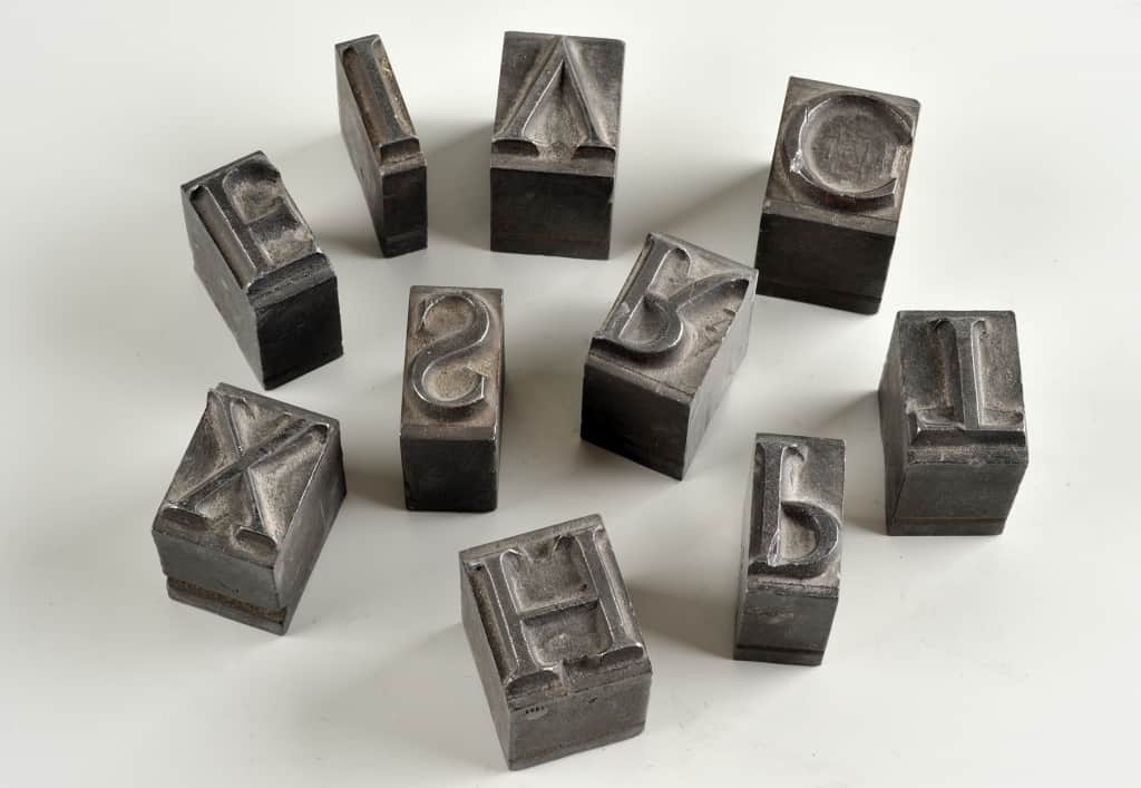
What links a page from an early printed book, the Linotype (a nineteenth-century line-casting machine, weighing over a thousand kilos), the design of a letter on tracing-paper, a film for printing, a piece of lead type, a woodcut, a lithographic stone, a guillotine, letter-punches, composing-sticks, computer packages, digital files ….? Tiny or huge, elegant or functional, all these objects are part of our typographical heritage, whether they be physical or immaterial, invisible or weighing tons; they reflect the practice and the skills of those who have succeeded one another down the centuries.
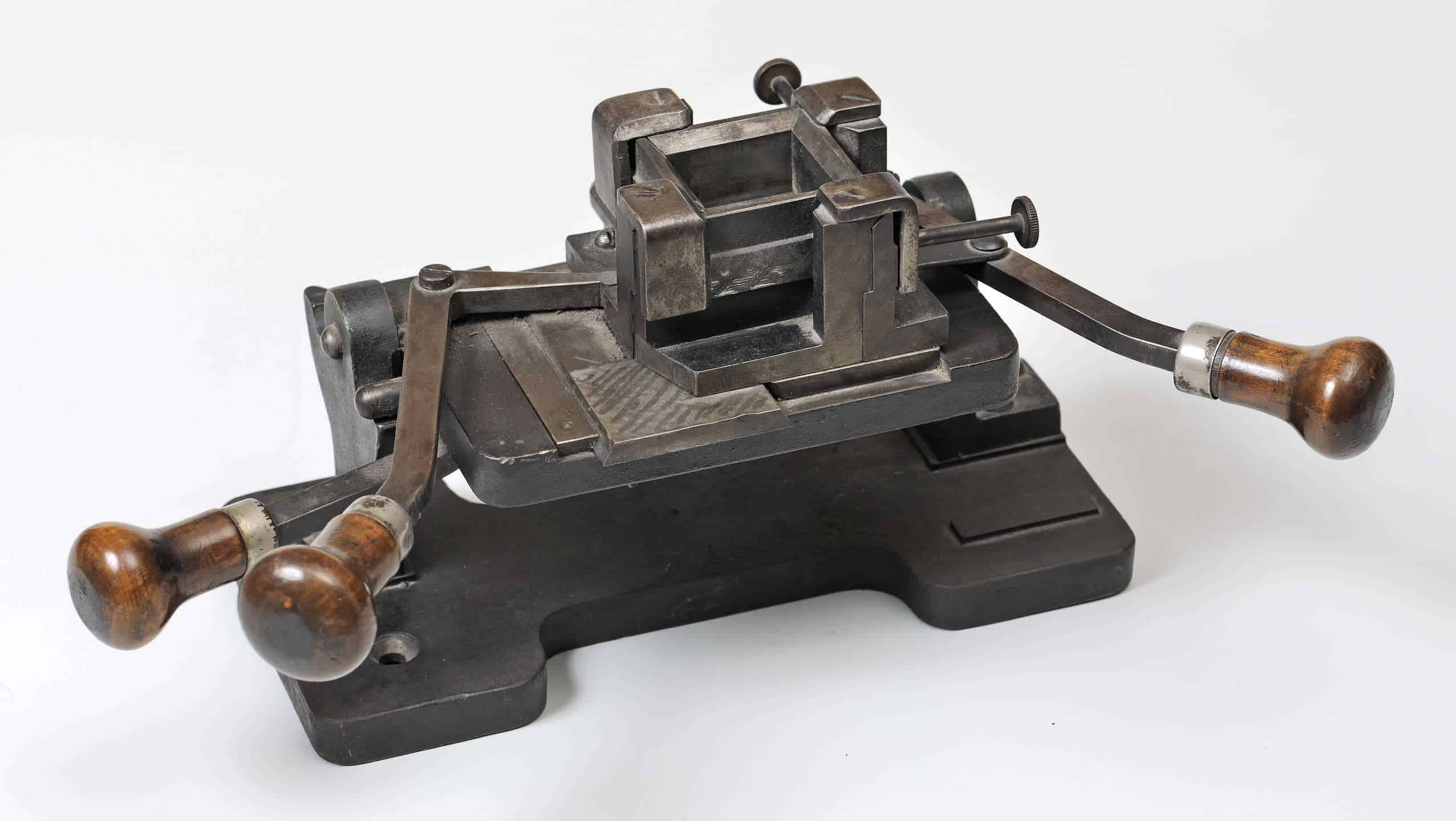
Mould used for duplicating large sizes of type. (Musée de l’imprimerie et de la communication graphique.)
A page of the 42-line Bible is very close to the Gothic script which was the inspiration for Gutenberg’s types. Here we see the beginning of the notion of the typeface, constantly feeding off manuscript forms. In more recent times we have the example of the Mistral typeface, created in 1953 by the Frenchman Roger Excoffon. In order to give lead type the dynamic character of manuscript, Excoffon took inspiration from his own handwriting and literally modelled it in metal. Models of letterforms whether manuscript or type, punches, matrices and lead types, as well as original letter drawings, phototypes and computer programs all have an equally legitimate place in the cupboard marked “typographical heritage”. Ornaments are there too: head-pieces, tail-pieces, rules, printer’s flowers, initials, vignettes have fared variously as fashions have changed. They have all left their mark on their period and enable us to place printed documents in their historical and visual context. The sublime ornaments of a de Tournes (sixteenth century) did not withstand the excesses of baroque, nor the simplification of the neoclassical typography of a Didot or a Boldoni (eighteenth and nineteenth centuries). Art Nouveau and Art Deco influenced the design of lettering in their day, breathing life into the accompanying ornaments, all curves and arabesques. Today some publishers of fonts have reinterpreted traditional vignettes to suit contemporary taste in graphic design, while the widespread availability of IT has put the creation of characters within the reach of practically anyone.
A traditional print shop contained numerous pieces of equipment, many of which have of course disappeared from the modern type designer’s working environment which often resembles an office more than a workshop. We all know the type-case, with its little compartments for the letters, and the composing-stick where types are lined up to form words. But there is also a mass of graphic equipment, with evocative names, quite unsuspected by the ordinary mortal: frames, spaces, formes, clumps, galleys, pigs, friskets, stones, flongs, bevelling-machines, blankets, blocks, quoins … not forgetting machines for type-casting, composing and printing, and computers, large or small depending on the period. As new technology comes into the workshop, the printer is tempted sooner or later to send his old equipment, usually more bulky, to the scrap-heap. And as the pace of technological innovation has accelerated, a decreasing proportion of type-related machines and equipment has survived, increasing the difficulty of the task facing historians and bibliographers trying to understand how printed documents were produced, while at the same time putting into perspective some of the more outrageous claims which are regularly made concerning the imminent demise of the “printed word”.
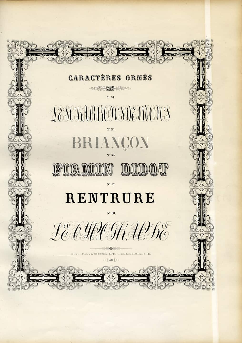
Type specimen issued by Charles Derriey’s typefoundry, Paris, 1862. (Musée de l’imprimerie et de la communication graphique.)
In the lead-type era, typefounders issued catalogues offering a wide variety of typefaces, ornaments, and vignettes. Specimen-books now constitute magnificent albums of lettering to browse through, but are above all a rich documentary source for historians of lettering and of printing. Cross-referencing these specimens and the occurrence of typefaces allows us to understand how they were used in books, newspapers, magazines, reviews, posters and jobbing printing. Behind the type we can perceive a period and a society, its way of life, its mood, its preoccupations – a rich, living heritage for our digital era, to be exploited by new generations of type designers. At the same time computer tools capable of identifying historical typefaces are being developed: a boon for researchers. But if the tools are to be effective and the corpus of digitised specimens is to be properly exploited, the people responsible for designing and developing the software must have very good knowledge of the history of lettering and typeforms.
Craft know-how is also an essential aspect of our typographical heritage. Since the end of the seventeenth century, a great deal of detailed professional knowledge has been committed to manuals, starting with that of the Joseph Moxon, The Mechanick Exercises in the whole art of printing (1683). In France in the eighteenth century there appeared the manuals by Martin-Dominique Fertel (La science pratique de l’imprimerie, 1723) and Pierre-Simon Fournier (Manuel typographique utile aux gens de lettres et à ceux qui exercent les différentes parties de l’art de l’imprimerie, 1764-66). The nineteenth and twentieth centuries saw the publication of numerous works which explained the techniques, actions, vocabulary and customs of the trade to future printers. There are still many older craftsmen who keep and treasure such documents, dating from their apprenticeship and used throughout their careers. It has to be admitted that the know-how of the late twentieth century has not always, as in previous times, been systematically recorded in such detail in manuals or other forms of technical documentation.

Pierre-Simon Fournier, ‘Manuel typographique utile aux gens de lettres et à ceux qui exercent les différentes parties de l’art de l’imprimerie’, 1723.
Our typographical heritage: its usefulness and its usage
It is not easy to decipher the operating and production methods of a centuries-old craft, in which the manual and the intellectual intersect. Output in the early centuries of printing was the work of individuals who were often at the same time artisans and men of letters, who frequently combined the roles of author, printer, publisher and bookseller. With the evolution of printing into the industrial era, skills changed and became more specialised, some disappearing, many more being born. In the nineteenth century the mechanisation of printing, and then of composition, gave rise to a new set of typographical skills and turned the organisation of the profession upside-down. More recently, the arrival of phototypesetting led to the disappearance of compositors of lead type. Before word processing and desktop publishing virtually wiped out the craft of typesetting as it had been known for over five centuries. Subsequently, the dematerialisation resulting from electronic photoengraving, DTP (desk-top publishing) and digital prepress has radically changed techniques, production organisation and even the very definition of the printing industry itself. It is therefore very difficult, in the absence of documents recording these continual and successive upheavals, to piece together the history of practice and know-how at the time when dematerialisation and digital media were bursting upon the scene. Another stumbling-block is that with some aspects of the trade – page-layout for example – little trace remains in the records or, to be more precise, firms often regard such records as of little importance and tend to sacrifice them when there is a shortage of space or a move to new premises. The same can be said of records relating to day-to-day relations between clients, publishers and graphic designers, which determine how a given item is designed with regard to its usage, market expectations, and social changes and their impact on ideas about printed material.
The printing industry has lost an enormous amount of evidence in the course of these successive transformations. The oldest presses are to be seen in the Plantin-Moretus Museum in Antwerp, but are no doubt already very different from the proto-press which Gutenberg used. Numerous tools and inventions, only to be seen in the form of illustrations in old catalogues of printing equipment suppliers, have disappeared for ever. Who has seen with his own eyes a fougeadoire? a belinograph? an ectenosynelcograph? a rotary printing press or a photoengraver’s electronic scanner? Metal used in print shops has also been highly prized as a raw material to be recycled (especially in times of war) with a subsequent loss of the historical types used by printers down through the centuries and, closer to today, few people have kept their first PC, Lisa or Macintosh. Nowadays, some printers contact museums before disposing of their machines, but it has to be said that this practice is only of recent date.
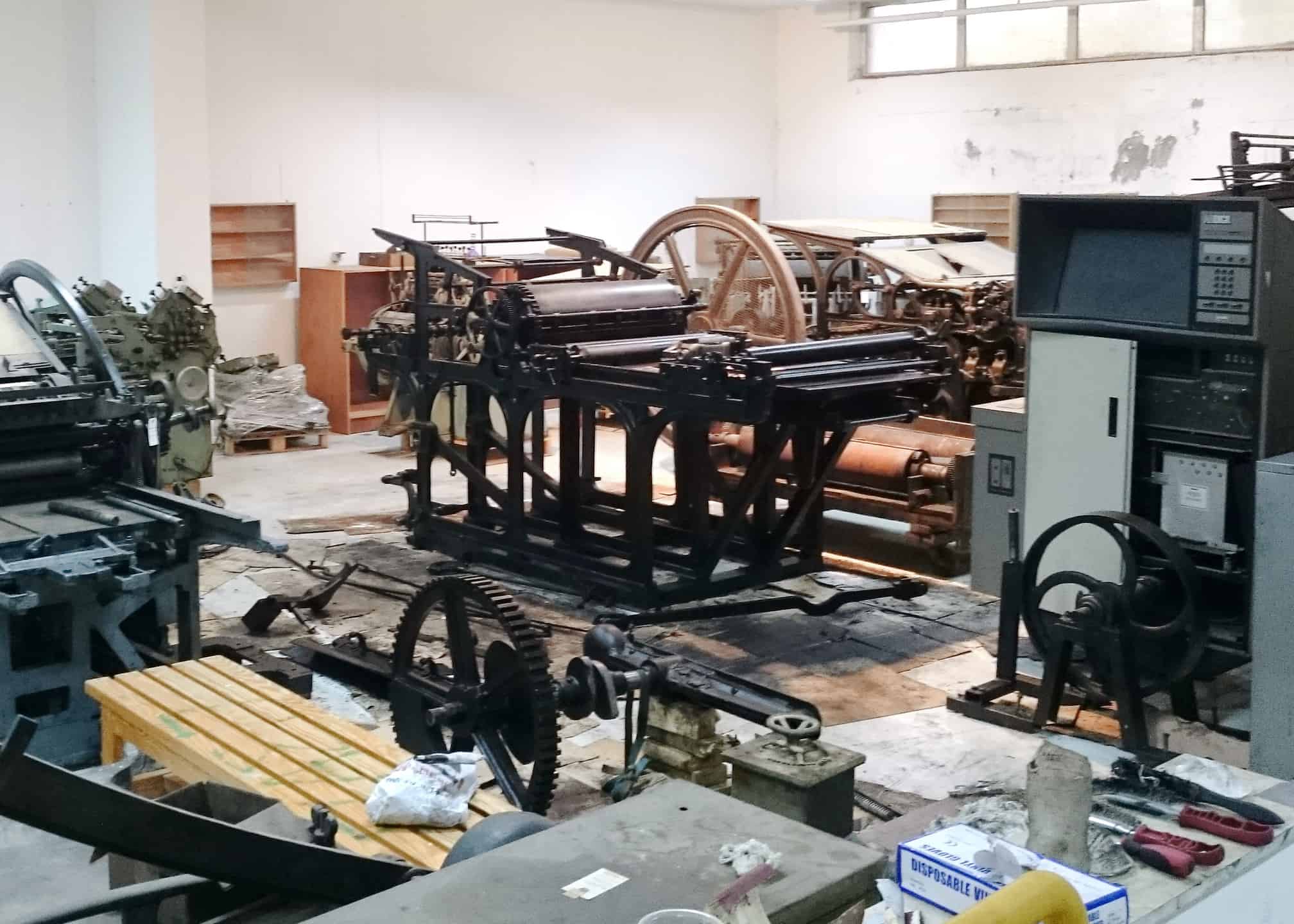
Presses undergoing restoration in the workshops of the University of Ioannina’s Museum of Typograpy and Graphic Arts Technology, Ioannina, Greece. (Photo: AM.)
Of course, it is impossible to preserve everything which has ever been used in a print shop, or even in a museum, given the size of certain objects and machines. But that does not alter the fact that the complete disappearance of some of these items, and of the accompanying technical documentation (which in itself takes little space), heavily compromises our knowledge of the industry and the way workshops operated in the past. Typographic heritage materials, in physical or in documentary form, are essential to enable us to analyse the past, to identify and date major developments in technology and communication, and to understand the social, cultural and economic context in which they took place.
Typographic heritage materials can also be a source of inspiration for contemporary type designers. For we must not forget that typographical creativity has never been as rich and abundant as it is today, thanks to the availability and modest cost of design software. In the 1950s, the number of typefaces in the Latin alphabet in current use was estimated at a few thousand. Today we have tens of thousands used by the “traditional” media as well as by television, cinema and a host of digital media: a mine of material exploited over and over again by successive generations of graphic designers in search of novelty. For it is virtually impossible to ignore the past in such a specific field as typographic design, with its constraints of readability which constantly take us back to the basics of the alphabet and its uses. But these basics have to be reinterpreted with every succeeding generation of technology, every change in taste, every new use of type (whether on traditional paper substrates or in digital media) in an increasingly complex world.
A tool for understanding our written heritage
Typographical heritage materials are an essential tool for those responsible for collections of printed matter – curators of libraries and museums – but also for any historian questioning the authenticity of a work, how its content was prepared, or in what form it was published. Let us recall again that despite the digital revolution we are still firmly in the sphere of the three raw materials of graphic communication: text, images, and the white space which provides order and hierarchy.
Knowledge of the typographical techniques and of the ways in which typographic products were designed and produced helps to determine which printed documents should be preserved and how, as well as allowing their identification and interpretation. At the present time, whole sections of nineteenth-century output of more or less ephemeral, everyday documents are still poorly classified because of the shortage of people sufficiently trained in the techniques and methods of production of that period.
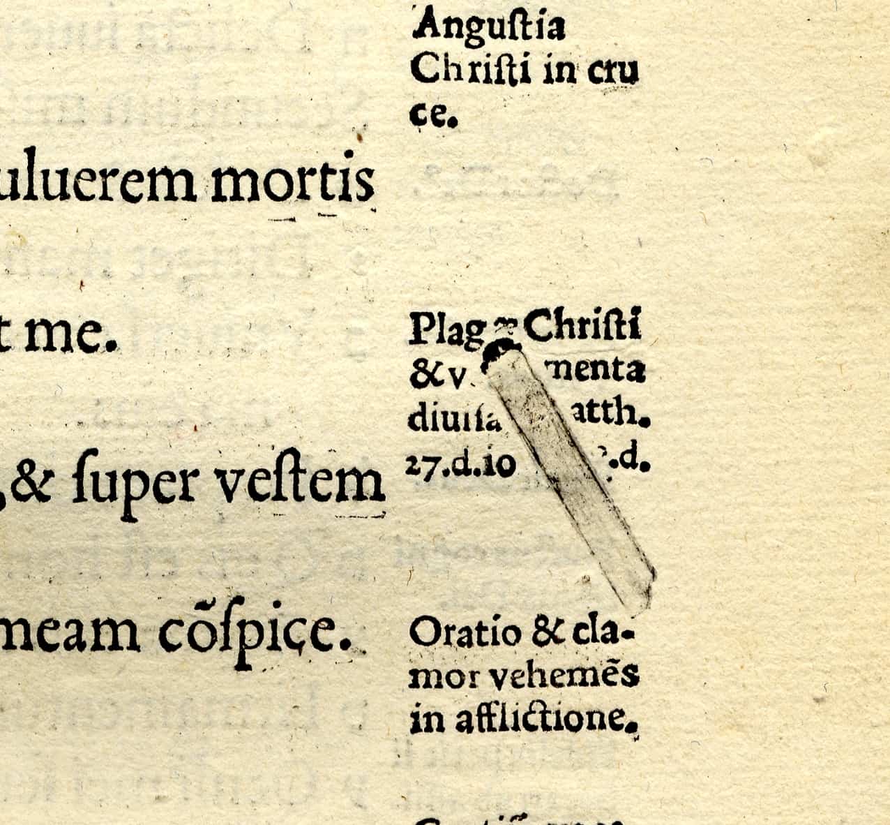
Impression left by a type displaced from the forme during the printing f an Estienne Bible, Paris, 1540. (Musée de l’imprimerie et de la communication graphique.)
Without objects or a knowledge of practice in the relevant trades, how is it possible to make a document “speak”? Typographic heritage materials provide explanations for certain procedures and phenomena familiar to bibliographers, such as the so-called “blind impressions” (an un-inked relief impression made by type used to support the paper in pages containing large blank areas) which can sometimes be used to identify the workshop where an unsigned, perhaps illicit, work was produced. Typographical artefacts cans also provide simple explanations of seemingly complex techniques. A good example of this is the hand-mould, whose operation is almost impossible to comprehend from an examination diagrams in printers’ manuals or of lead types themselves, but which becomes immediately clear on seeing the object itself. The same could be said of the hand-press and of typesetting machines, whether hot-metal or photographic.
In view of the renewed interest in typography on the part of graphic designers and of a part of the general public – at a time when anyone, using the modest technical means, can claim to be a graphic artist or even typeface designer – it is of prime importance to interpret, promote and publicise our typographical heritage. To be able to understand why a certain book is inviting to read, why a poster attracts or surprises, why the typeface for the credits of a film is so well chosen that it already tells us the story, we have to have keys and references. To make best use of the multitude of typefaces on our computer (far more than in most fair-sized print shops in the early twentieth century), we need intellectual tools to compare, understand and give us pointers. We need a collective memory, and that is what is on offer from the Association of European Printing Museums (AEPM), which brings together an extraordinarily rich heritage, cared for by its many members, workshops and institutions.

General view of the Atelier-Musée de l’imprimerie (AMI) the latest addition Europe’s constantly growing population of printing museums. (Photo: Atelier-Musée de l’imprimerie, Malesherbes, France.)
The range of museums concerned with conservation, practical activity and history of printing are very diverse and the AEPM includes a wide variety of institutions: some museums specialise in paper, some in printing techniques, others are veritable store-houses of machines; many offer a wide panorama of techniques and know-how across the spectrum of graphic communication. Some are more oriented towards the conservation of typographical heritage materials and offer an exceptional expertise in their field. To mention but a few examples, the Plantin-Moretus Museum in Antwerp, centred round the work of Christopher Plantin and his successors, possesses the largest collection of punches preserved from the sixteenth century; the Imprimerie nationale in Paris holds a unique collection of punches (the Cabinet des poinçons) used to produce several centuries of immensely influential French type faces; the Druckmuseum in Darmstadt and the Bodoni Museum in Parma also hold veritable treasures of typographical materials. The Printing Museum in Lyons has important collections relating to the invention of photocomposition, notably the archives of the inventors of the Lumitype-Photon, René Higonnet and Louis Moyroud.
But typographical heritage is not simply composed of collections of objects and machines; it also includes people, trades, processes of design and production. Alongside the collections already mentioned there exist important store-houses of practical knowledge, such as the Typorama workshop in Switzerland, the Printing Museum in Nantes, or Format Typographique at Saran in France. These sites are not simply concerned with the preservation of artefacts: even more importantly their mission is to perpetuate the knowledge and use of traditional techniques, often going back many generations.
One of the major challenges facing the members of the Association of European Printing Museums is to evoke the creative and technical processes as well as the finished product. Traditionally the writing of the history of printing has been split between bibliographers and historians on one side, printers on the other. The former are generally strong in theory and methodology, but do not always have intimate knowledge of the mysteries of production; for their part the practitioners who study and write the history of their own trade may sometimes lack a “scientific” approach. But in tandem bibliographers and printers have, for generations, complemented each other admirably. This great tradition is perpetuated by the members of the AEPM, thanks to the multiplicity of interdisciplinary collaborations and crossovers which naturally occur as the conservation of typographical heritage materials and craft skills constantly feed off each other.
Major heritage institutions, libraries and museums, are often closely tied into their historical, intellectual, economic or religious origins, and to their specific national history of graphic communication. Most countries having now published their national history of printing, books and publishing, the time is now ripe to pursue international comparisons. One of the objectives of the AEPM is therefore to build on the diversity of its members and their collections, in order to respond to new questions. What local factors have contributed to the exchanges which have spread to the four corners of Europe? What factors have retarded or accelerated that diffusion, be they political, economic, technical or religious? Such bridge-building can only take place through collaboration at a European level – or why not an even wider one.
Alan Marshall, Bernadette Moglia, Alice Savoie
![]()