We spent the year in printshops and beyond. It’s been a full year of printing and learning. As you might remember, the practical part of this year’s programme took place across two letterpress workshops in Belgium: Atelier ’t in Bierbeek and the printmaking department of the Museum of Industry in Ghent.
But it didn’t stop there. Along the way we visited public collection, such as the National Playing Card Museum and of and private collection of Patrick Goossens, spent time with beautiful book collections of Hendrik Conscience Heritage Library and Museum Plantin-Moretus in Antwerp, and dropped in on working letterpress studio of Ruud Huysmans in the Netherlands. We also hosted video lectures with fellow printers, opening up conversations about the present — and future — of letterpress printing.
If you missed some of the earlier blog posts about these activities, you can catch up here:
Long live the Black Arts / One-year course typesetting 2024-2025. The beginnings. Atelier t.
Long live the Black Arts / Visiting Hendrik Conscience Heritage Library and Museum Plantin-Moretus in Antwerp
Long live the Black Arts / Visiting the collection of project Letter-Kunde by Patrick Goossens in Antwerp (BE)
Long live the Black Arts / Visiting the National Playing Card Museum in Turnhout
Long live the Black Arts / Visiting Ruud Huysmans (NL)
and of course some pictures 😉
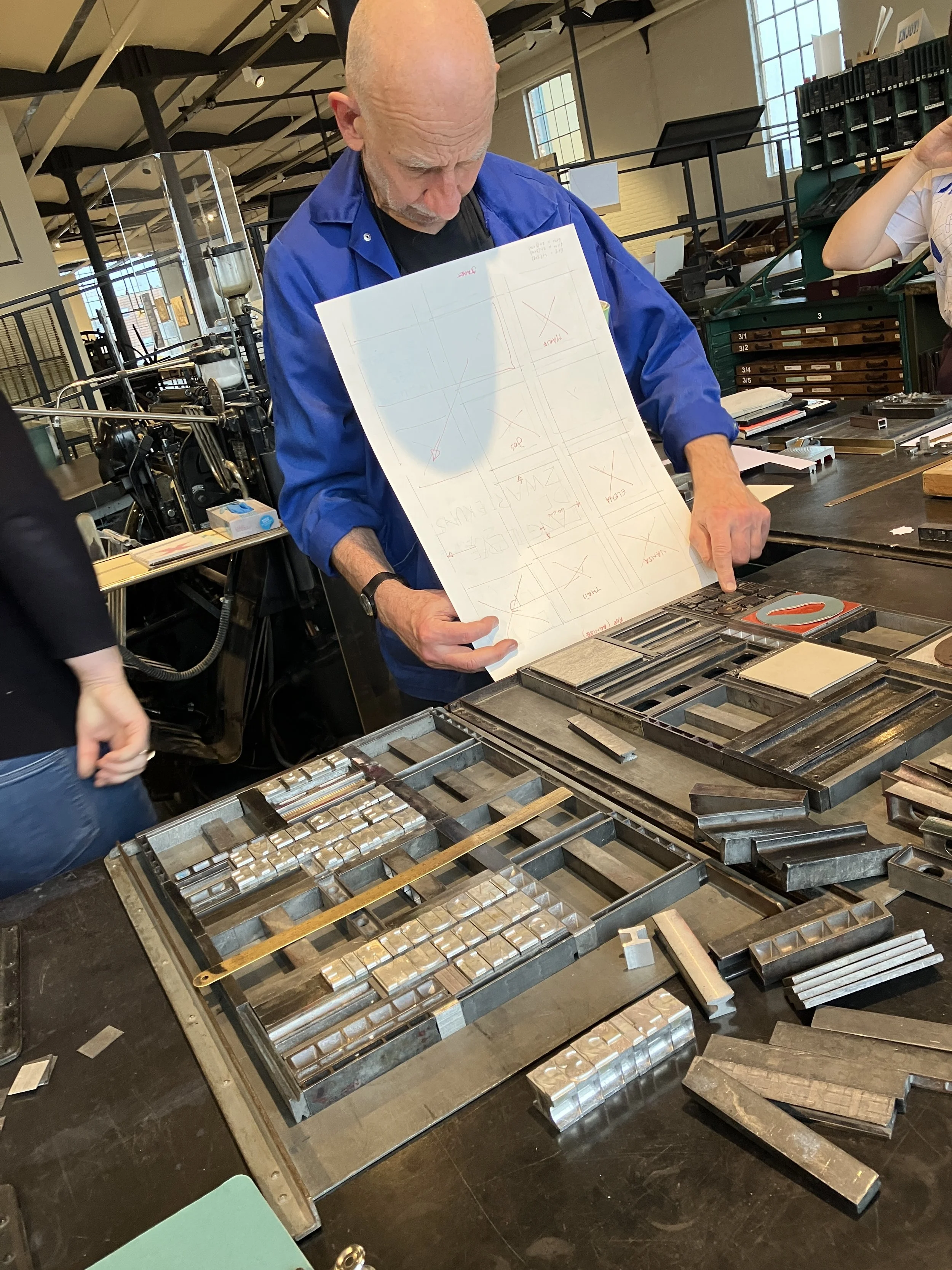
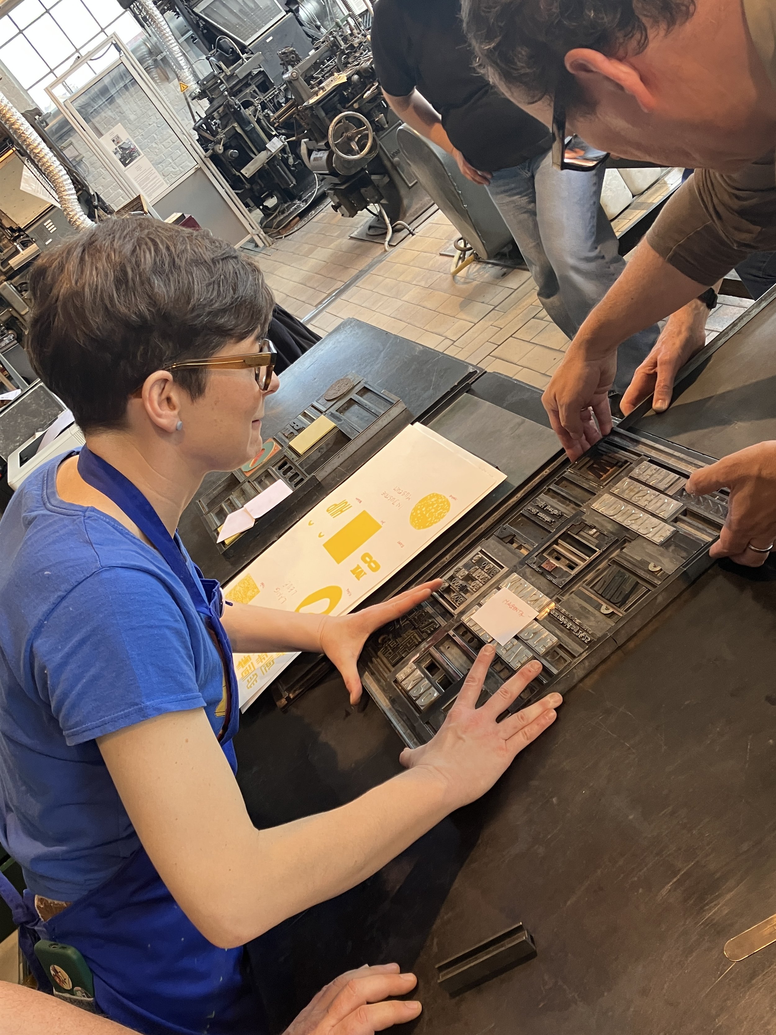
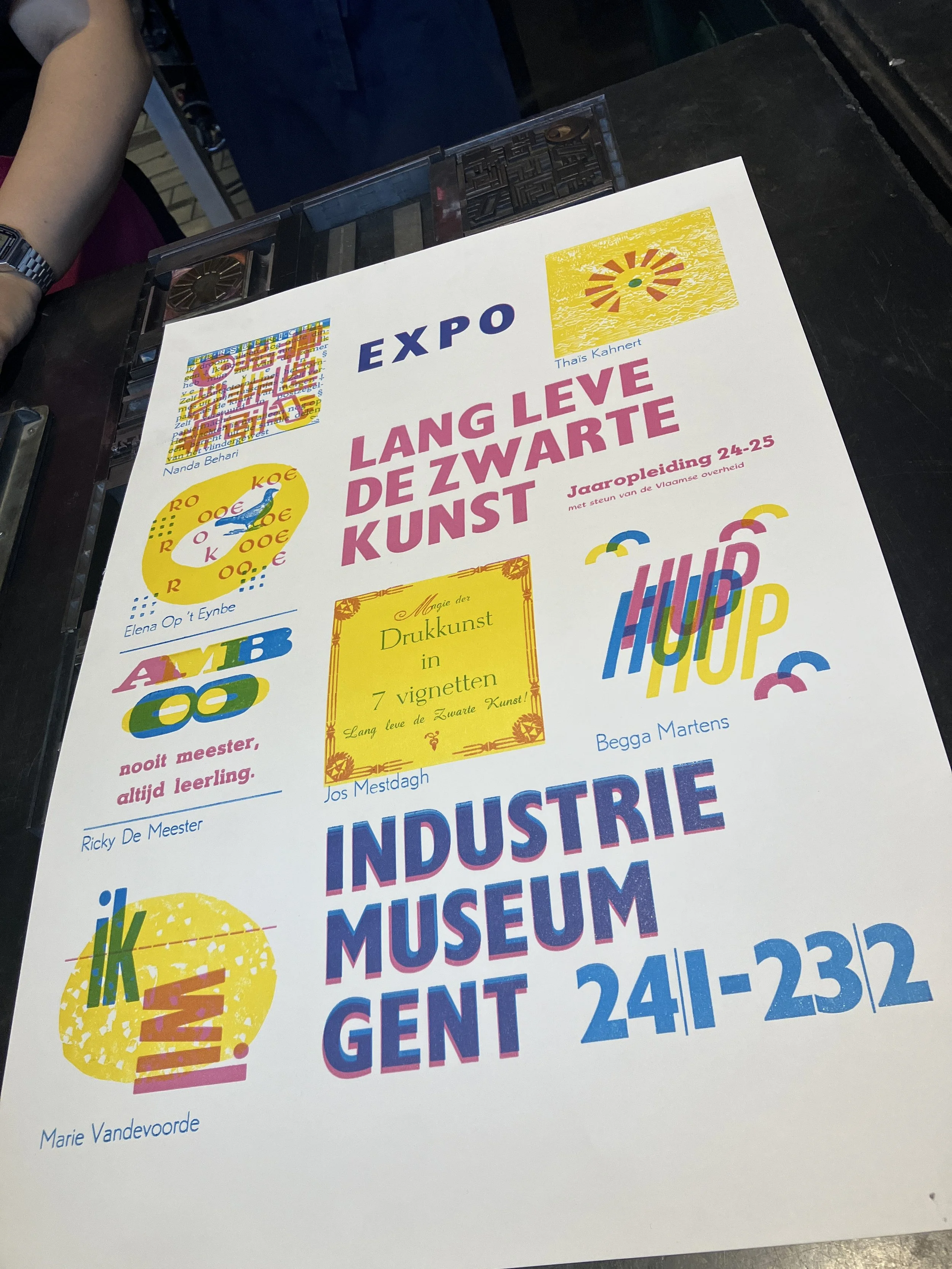
So what did we work on during the last three-day session? Right — the exhibition poster. The poster is a collective effort by all seven students, with the title set by Thomas Gravemaker using large metal type from the museum’s collection.
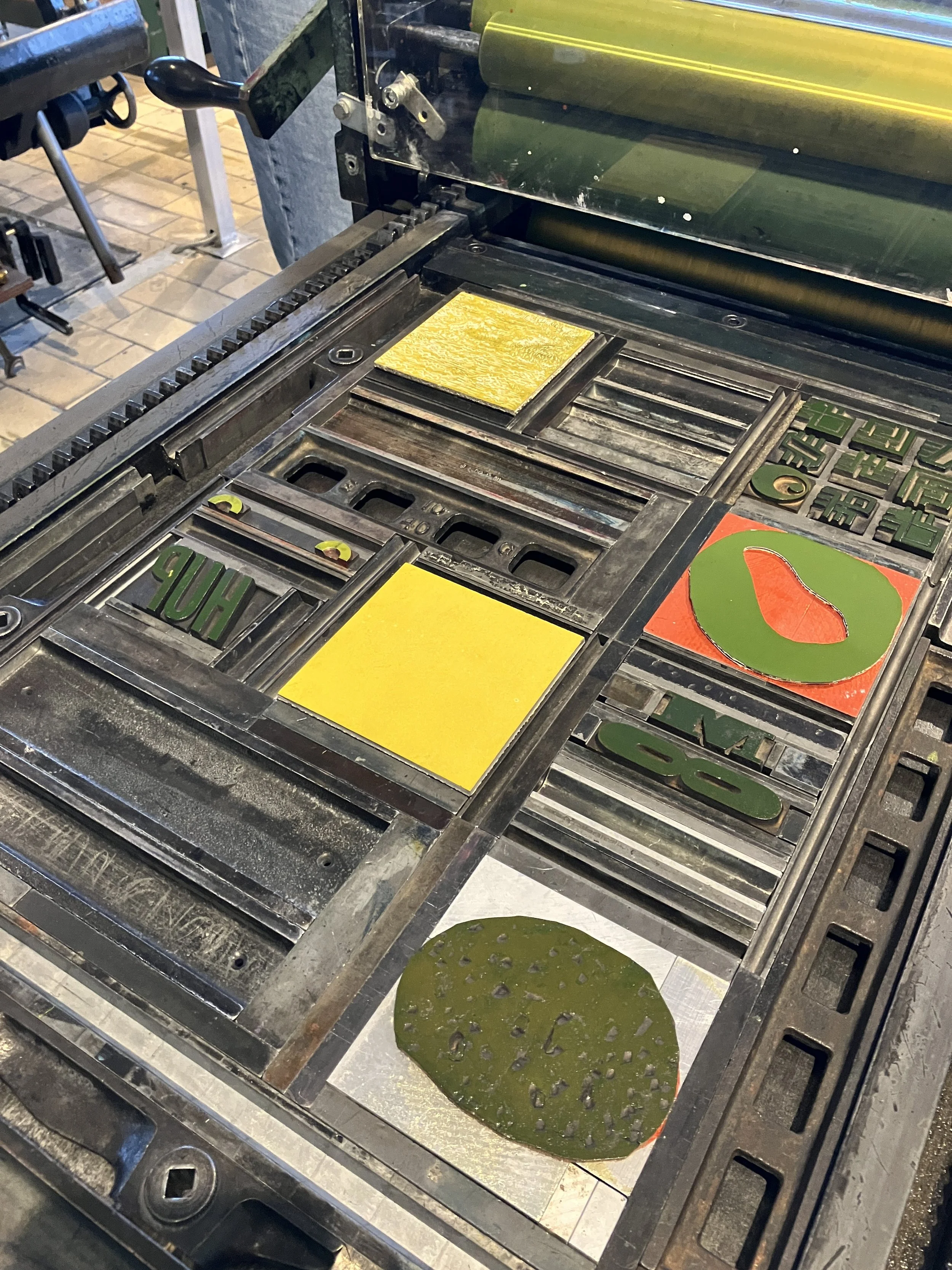
The idea is straightforward, but full of possibilities. Each student designed and typeset a three-colour composition — yellow, magenta, and cyan — within a square of 20 cicero. Three colours, three formes. They had access to a wide range of material: wood and metal type, linocuts, engravings. Everyone brought together everything they’d learned over the past year, resulting in a series of prints that are varied, personal, and surprisingly cohesive. Lots of inking, proofing, adjusting — and plenty of good conversations around the press.
What stands out is the confidence with which they now handle typographic material, the care in their typesetting, and the creativity evident in their compositions. The exhibition is not just a presentation of finished prints, but evidence of learning through making, collaboration, and sustained engagement with the craft.
We look forward to welcoming you in Ghent!


