The Grecs du Roi meet early Cretan literature in a street art performance throughout Crete: a school project
Text of a paper given by George Matthiopoulos at the conference of the Association of European Printing Museums, Making history: collections, collectors and the cultural role of printing museums, Museum of Typography, Chania, (Crete, Greece), 11-14 May 2017.
George D. Matthiopoulos
Dept. of Graphic Design, TEI Athens
Greek typographic presence dates back to the early decades of the revolutionary invention of printing. Gutenberg conceived and materialized his idea of reusable metal types for text printing when the Gothic hand was the principal choice of the scribes and readers alike in Europe. This, consequently, informed his design choice of the type he used in his first printed Bible. The relative simplicity of the prevailing vertical strokes executed by the pen of the scribe while writing, and their dense positioning next to each other, made easier the conceptualization of the solution and the success of its technical implementation. In effect, printing was born at a historical confluence, when the rising need for multiple copies of any given text merged with the uncomplicated, almost mechanical motion of the prevailing writing style of the era.
This is the crux of the issue in terms of design and technological innovation, and it should be well understood, before we begin our probing into the early Greek types. As printing know-how broke away from Mainz and the new art was brought south of the Alps to meet the gathering pace of the Italian Humanism, the need to incorporate Greek texts became apparent.
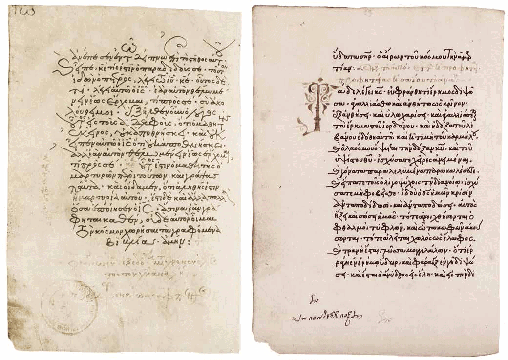
Manuscripts of the 14th and 15th centuries.
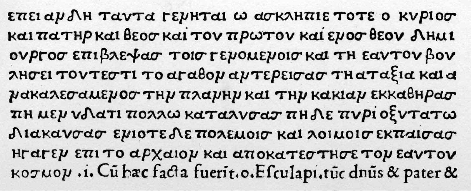
At that period, in the 1460s and 1470s, few Greek scholars were available to consult the printers/publishers and no Greek was yet trained into the intricate work of type cutting. After having a cursory look to any Greek manuscript of the 15th c. or earlier, even a non-specialist will surmise that the intricate and full of flourishes Byzantine cursive hand bears little resemblance to the monotonous rhythm of vertical strokes found in Gothic scripts. As a result, the first generation of printers in Western Europe threw out the historical visual baggage of the Greek alphabet and isolated, as best they could, the 24 miniscule letters, often devoid of any diacritics in order to meet their modest requirements for short passages of Greek text. For the time being, this simple solution answered the moderate demands of the publishing market and it persisted as a model for several decades. The crowning moment of this design approach and ironically also its swan song was the Greek type cut by Guyen de Brocar, a Frenchman living and working in Spain, for the famous Complutensian Polyglot Bible, in 1512 at the University of Alcala.
Early Greco-Latin types.
Above: Greek type of Wendelin da Spira.
Below: Greek type of Nicolas Jenson.
Complutensian Greek type, Spain.
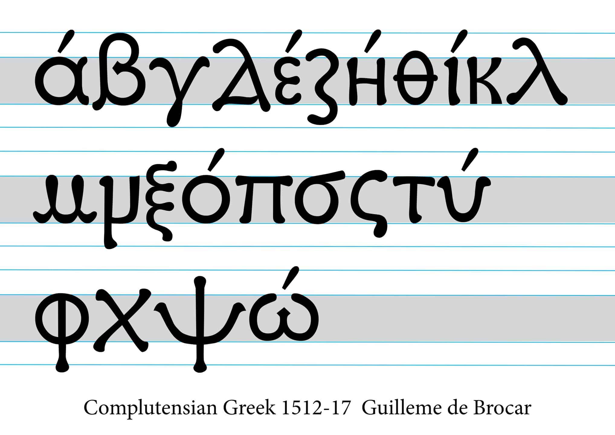
Complutensian Greek 1512-17 Guilleme de Brocar.
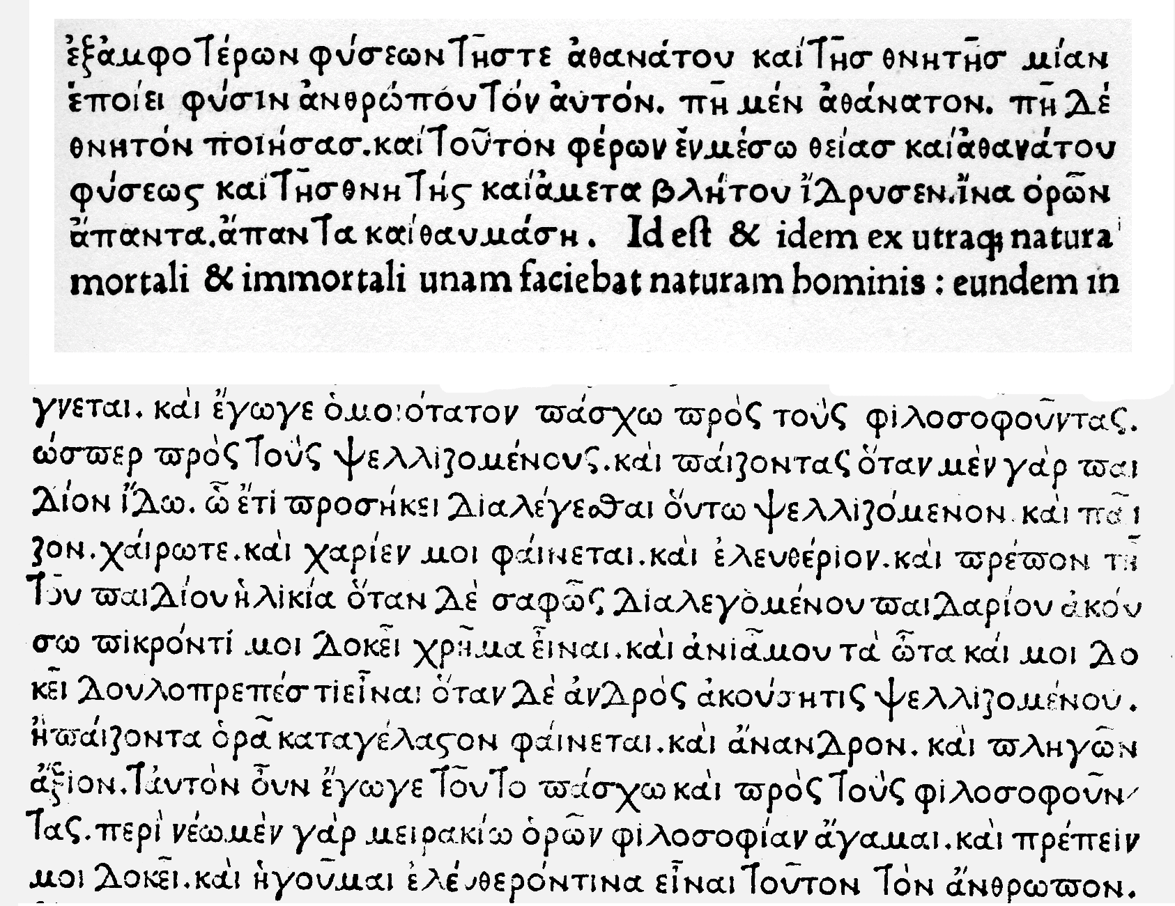
From the mid 1470s onwards and in the 80s and 90s the increasing number of Greek editions in Italy ushered new experiments and innovations concerning the shape of the Greek types. In choosing to produce a distinct Greek type style, the so-called “backward look” was already at play. We notice the first clear instances where the types started tentatively to follow the older Greek writing tradition, which included a fair number of ligatures and alternative designs of certain letters, including a full set of capitals and all the accents and diacritics. From then onwards we can detect a new development that defied the primal techno-aesthetic premise of printing, which we have already referred to: that is, the harmonious and rhythmic alternation between vertical black strokes visually separated by equal white space. In these renderings of the Greek writing hand we can notice a more pronounced thin and thick stroke, while the baseline is constantly challenged by a proliferation of ascenders and descenders, overlapping accents and diagonal strokes. Typography, through the introduction of Greek writing, had been taken away from its comfort zone, and as Renaissance’s thirst for Greek grew, new problems arose waiting for novel solutions.
Manuel Chrysoloras, Erotemata, Vicenza, c. 1474-5.
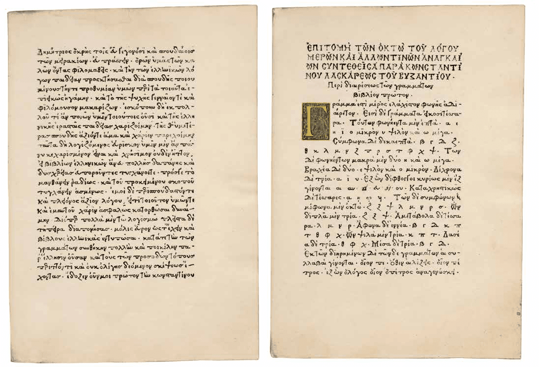
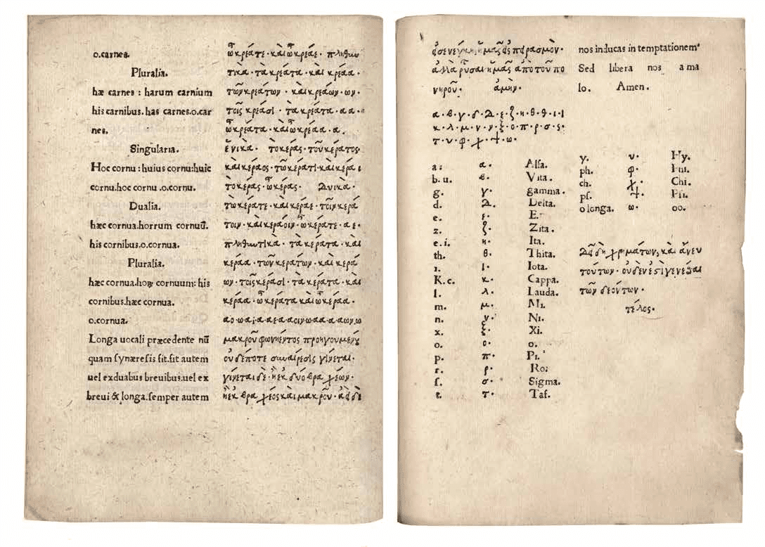
Constantine Laskaris, Epitome…, D. Damilas, 1476.
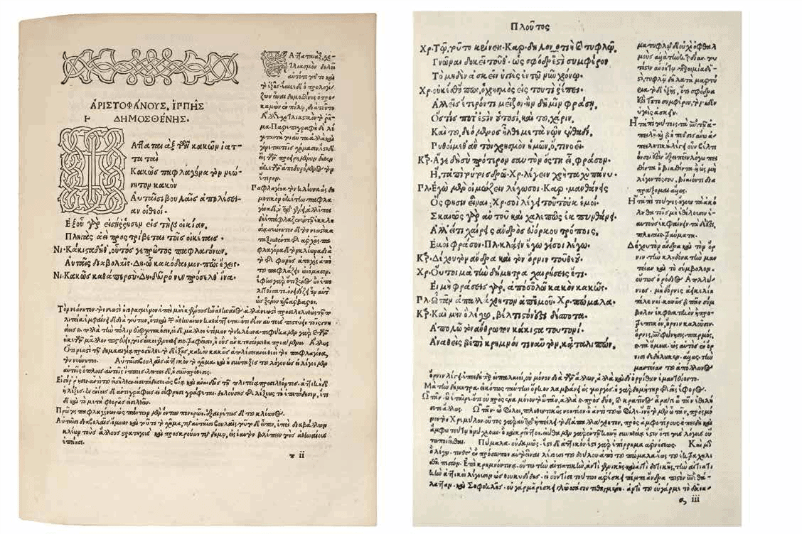
In 1486, we observe a flashing trajectory that has no parallel in early typographic practice. Two Cretan men of the cloth, Laonikos and Alexandros, attempted and, more significantly, materialized the unthinkable. A full-scale Byzantine hand composed of no less than 1,296 shorts, of either single or ligatured characters. The two books they produced were astonishing not in terms of the overall visual result, but mainly in the daring ambition and innovative application in type cutting boundaries so early in the development of the typographic craft. Imagine, 780 engraved punches combined in known and novel ways to cast 1,296 shorts in order to reproduce the visual effect of a 12th century Byzantine liturgical hand (Perlschrift), and in addition, the first book was printed in alternate black and red ink! The editions were not a publishing success at the time and the two innovators slipped back to oblivion, but they were the catalyst for pointing to different alternative solutions, thinking out of the box, as it were, in terms of type cutting and typesetting norms. They blazed a new path for Greek printing, at the time, and their precedent opened the way for Aldus Manutius to gamble and succeed in his publishing plans a decade later.
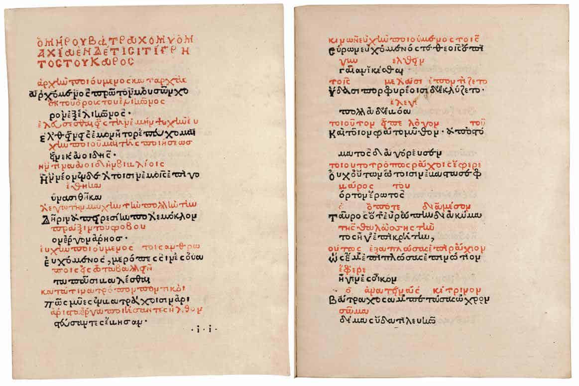
Batrachomyomachia, Laonicos & Alexandros, 1486.
Aldus Manutius’ bold decision to enter into the publishing business in Venice, and to concentrate in Greek editions was also ambitious, but well prepared. Aldus opted to model the Greek characters of his first editions not on the notion of the “backward look”, which his predecessors had followed for safety and in reverence of the past, but on the handwriting of his contemporary Greek scholars. A daring step that somehow caught on, while coupled with his publishing success of the complete corpus of the ancient Greek and Latin literature, it redefined and, in the end, established this novel choice for all Greek books thereafter. Aldus managed to alter the course of typographic history, both in Greek and in Latin typography and his innovations resonated for many decades after his death.
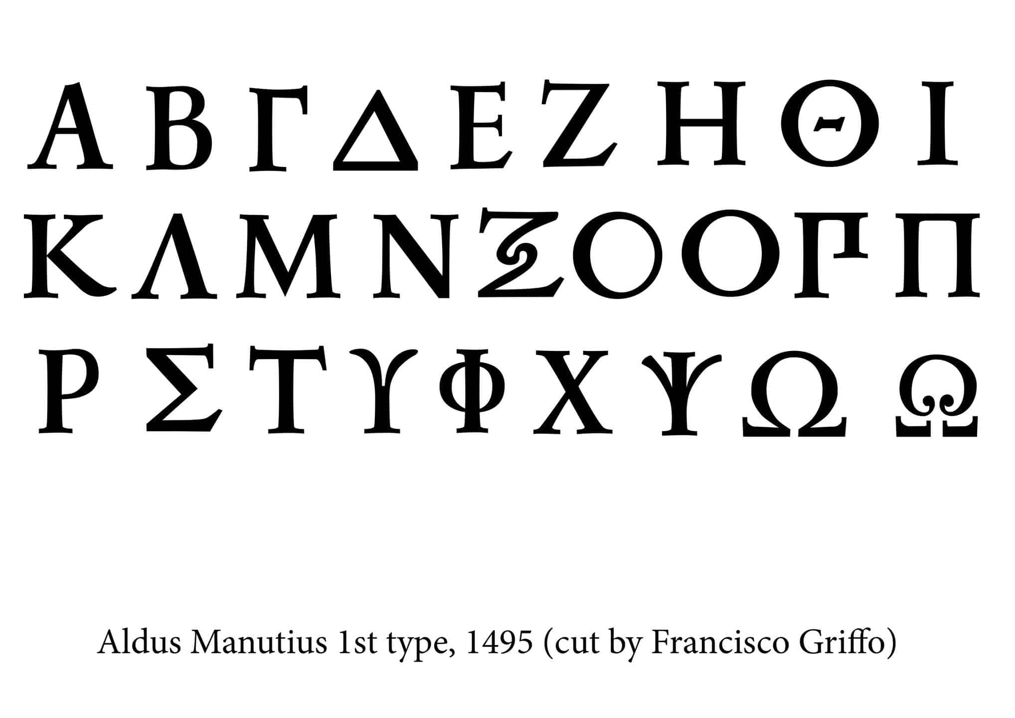
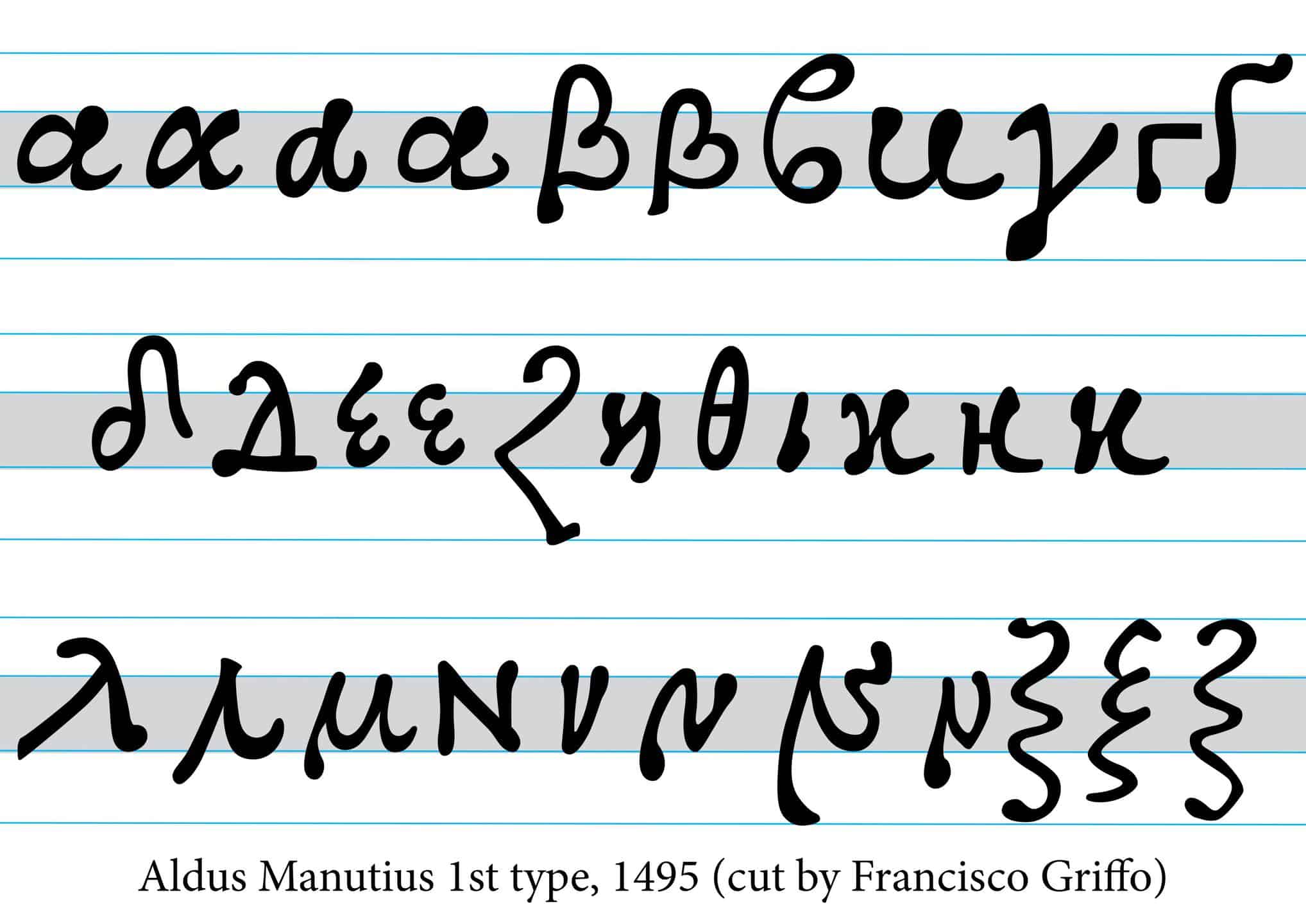
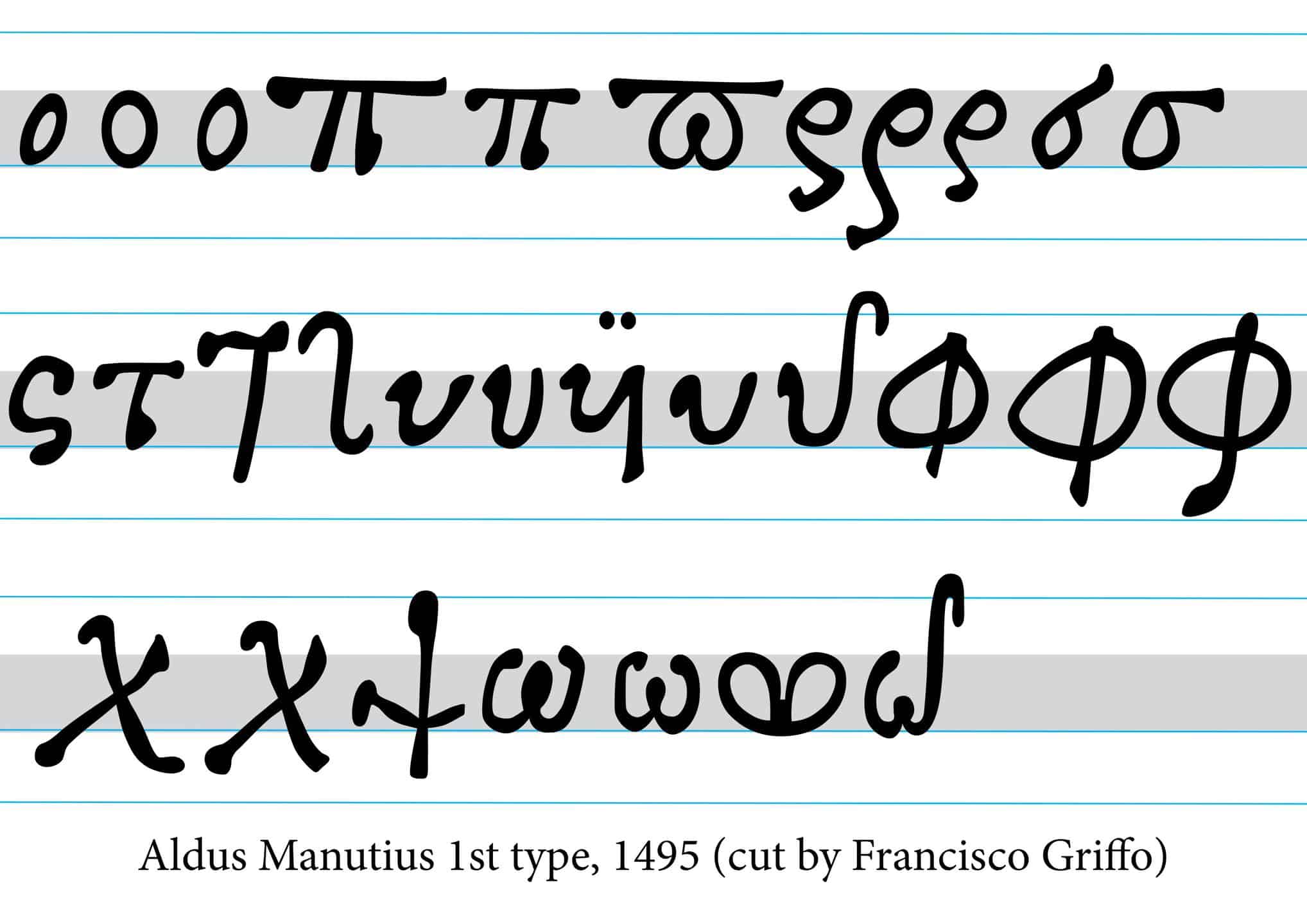
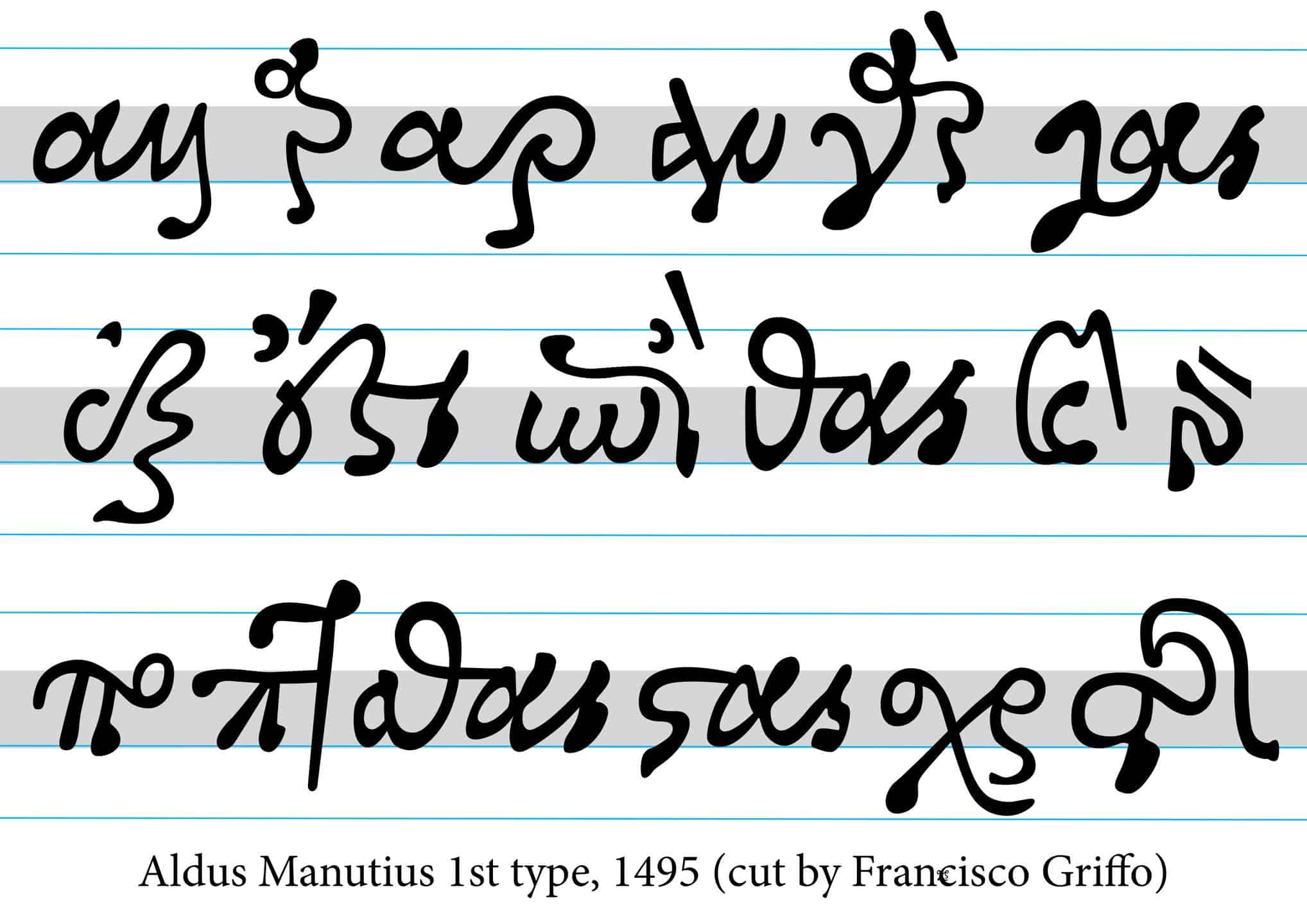
Aldus Manutius, 1st type, 1495.
Aldus Manutius, 2nd type for scolia, 1496.
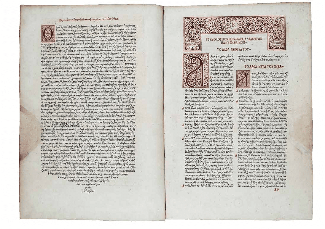
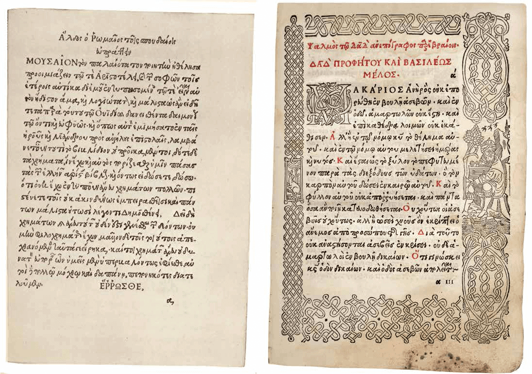
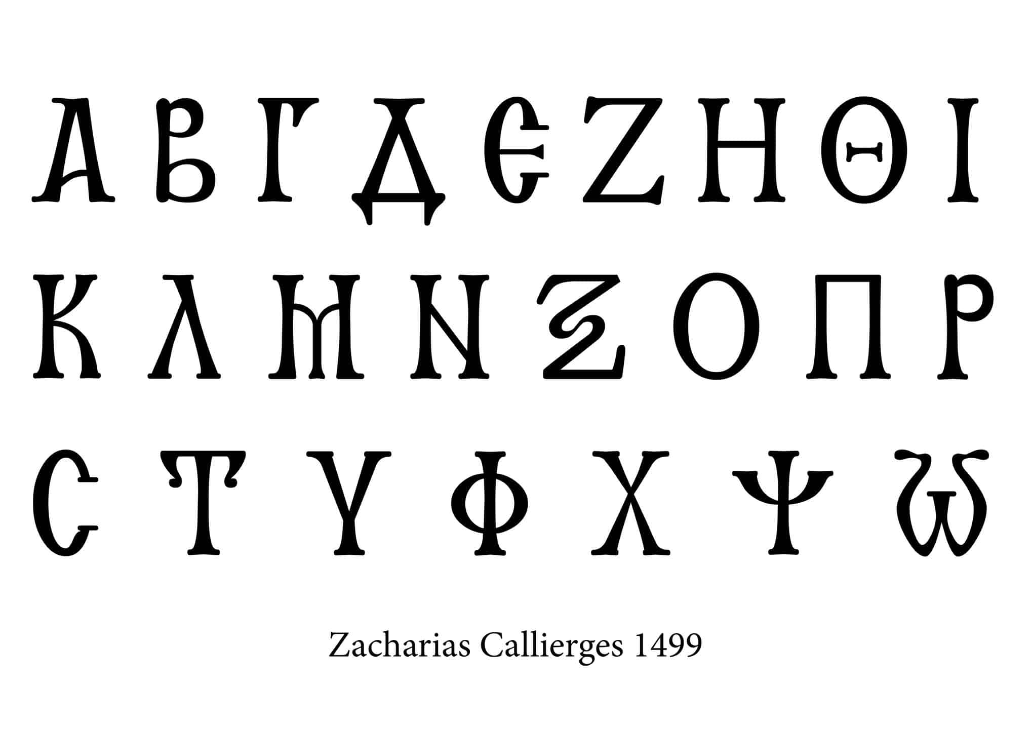
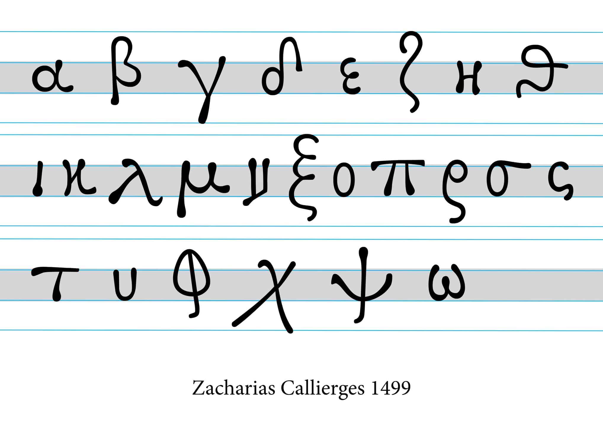
Etymologicum Magnum, Venice 1499.
Another attempt to define the course of Greek typographic developments came at almost the same time. In the 1490s Nicolaos Vlastos, a Cretan merchant, collaborated with Zacharias Kalliergis, a gifted Cretan scribe and type cutter, to produce four magnificent books in which a new model of type design was proposed. It was equally beautiful and demanding in technical expertise as those of Aldus’, but the short-lived presence of their publishing company could not rival the enduring Aldine hegemony.
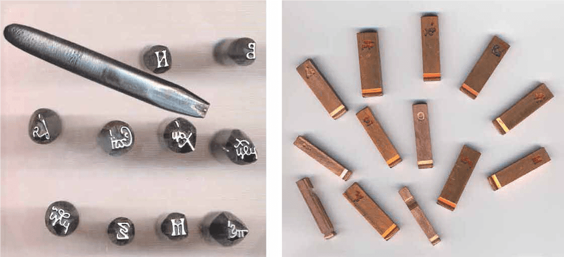
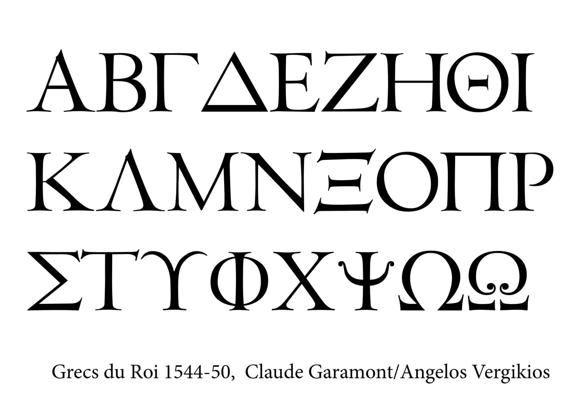
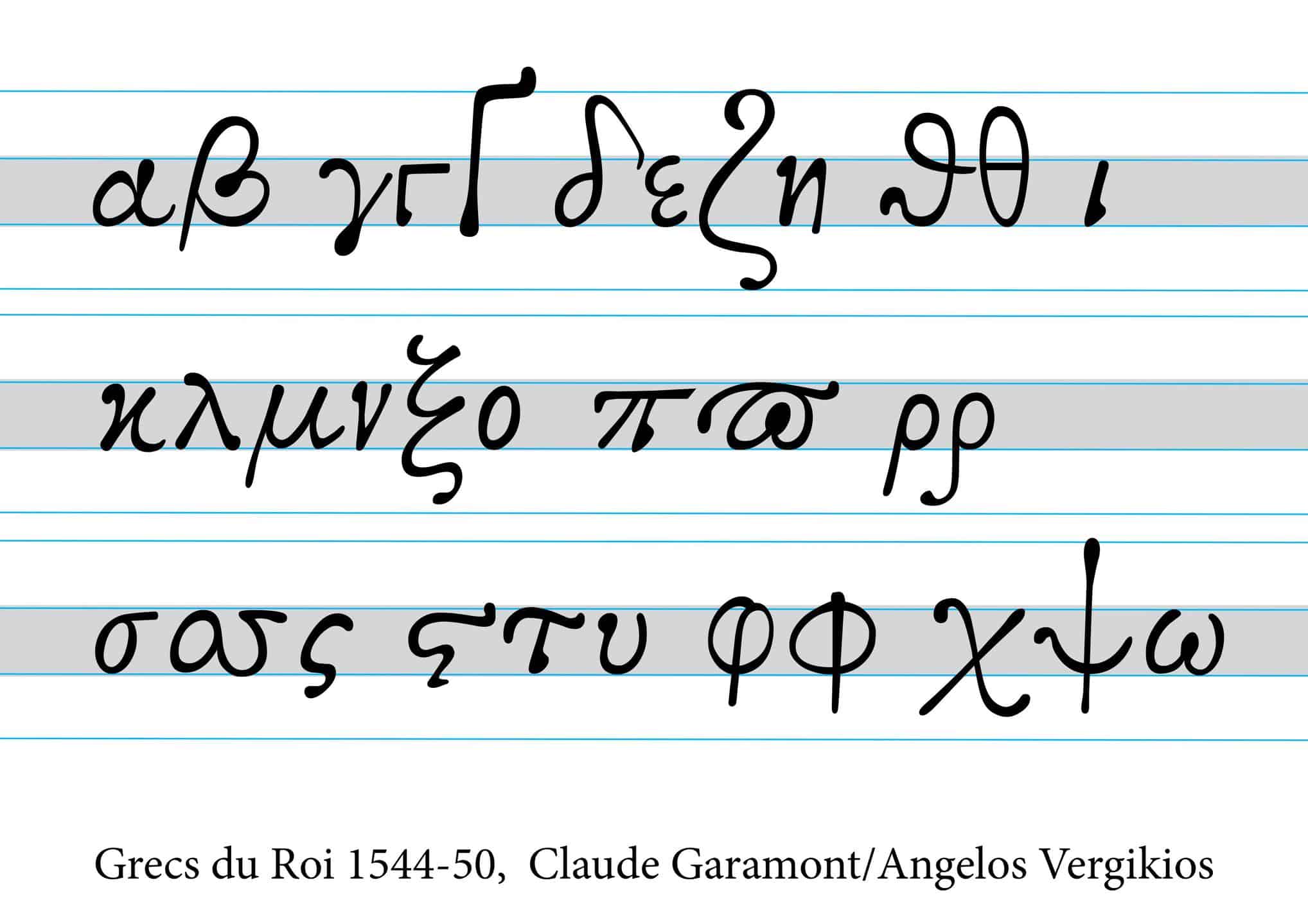
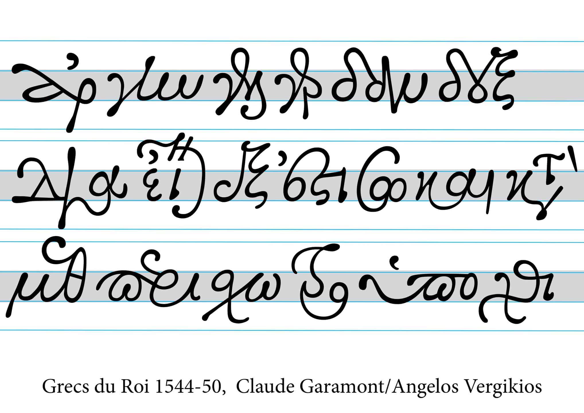
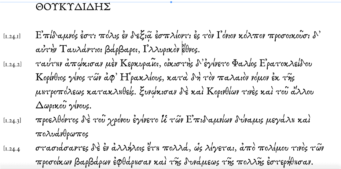
In the early decades of the 16th century France became the new center of political dominance in Western Europe and, as the Humanist paradigm and the Renaissance aesthetics spread northwards, Paris was making a serious effort first to emulate, then assimilate and finally surpass the Italian dominance in scholarship and the arts. A pivotal force towards this goal was a dedicated group of Hellenist scholars and master printers: Simon de Colines, Jodocus Badius (Josse Bade), Guillaume Budé, Giles de Gourmont, the Estiennes family, Geoffroy Tory, Claude Garamont and Michel de Vascosan. Tory, the most fervent advocate of Italian Renaissance in France, was instrumental in introducing Aldus’ choices in type, both for the upright Roman, as well as his choice of modeling Greek type after fine contemporary scribes. Concerning the later, when the Royal library needed to reorganize and expand its Greek volumes, Angelos Vergikios, a reknown Cretan scholar and exuberant scribe, was invited from Italy for the job. He collaborated closely with the Estiennes and his exuberant hand writing was chosen as the model for the most celebrated Greek type of the Renaissance. Claude Garamont, a master type-cutter of unparalleled artistry, achieved an astonishing feat in capturing the flamboyant style of the scribe, rendering every nuance and variation in the hundreds of his ligatures with visual rhythm and clarity. The Grecs du roi were cut in two different sizes, in the 1540s, and became the exclusive property of the Imprimerie royal. The punches, matrices and type have survived to this day and still amaze us with their craftsmanship in every detail. There were numerous imitations subsequently throughout Europe and they remained the principal model of any new attempt to cut Greek type until well into the second part of the 18th century, when new artistic ideas and different political and educational priorities led to the abandonment of the Byzantine tradition towards a new path of simplicity.
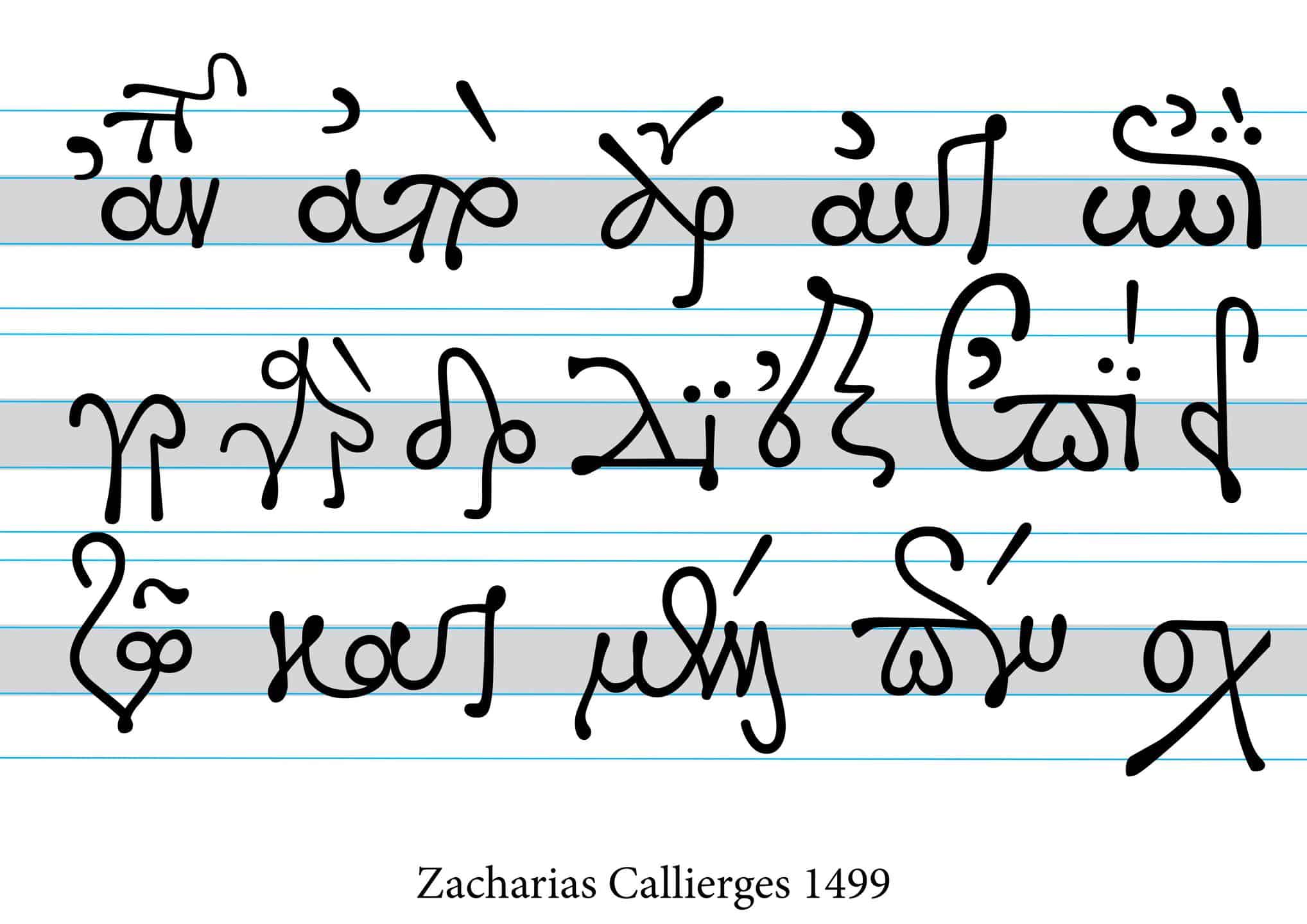
Handwriting of Angelos Vergikios, undated.
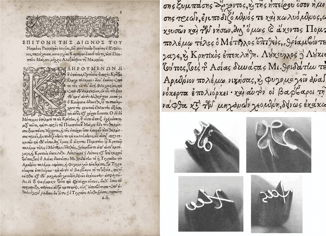
Grecs du Roi, Claude Garamont, 1544-50.
I have digitally designed the type as part of the on-going research of the Greek Font Society (www.greekfontsociety.gr) and it will soon be freely available for use. As part of the project, with my colleague Eva Masoura, we have developed an open type feature which allows any user to apply the use of the multiple ligatures for any Greek text. The complexity of the ligatures is such that even after the application some micro-typographic refinements are still necessary.
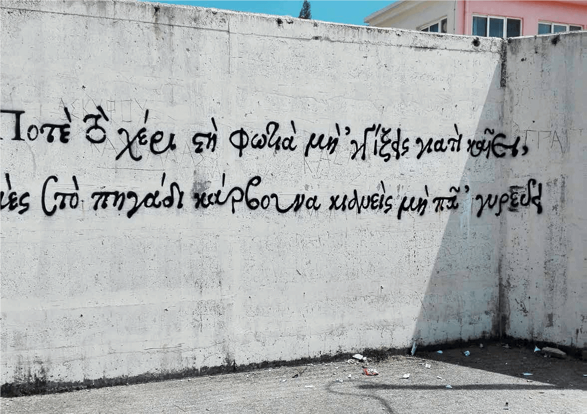
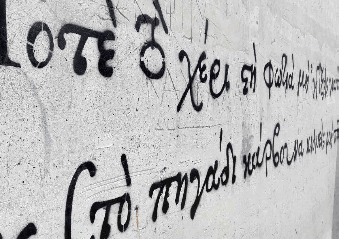
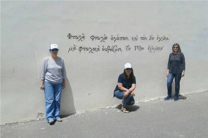
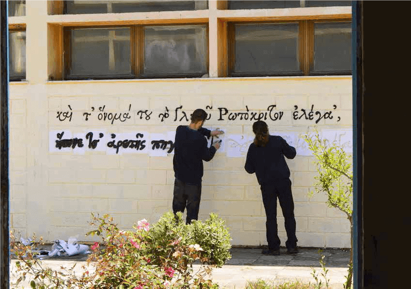
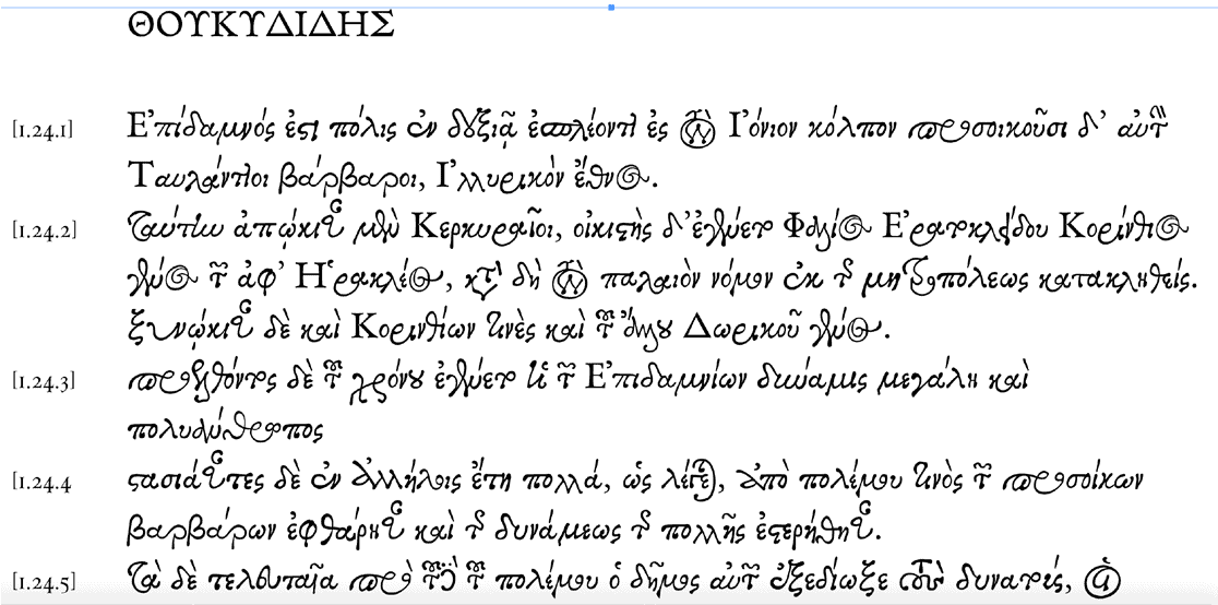
The beauty of this seminal post-Byzantine Greek type gave me the inspiration to engage in a hypothetical art concept of “rewriting” history. By the end of the 16th and the early 17th centuries the Grecs du roi had established their superiority through the prestigious publications of the Estiennes and were the type of choice for northern Europe, through a variety of copies. Greece had already been under the occupation of the Ottoman Empire, but Crete was one of the few surviving Venetian ruled territories in the Eastern Mediterranean. The island was at a period of prosperity and through the continuous interaction with the large Greek community in Venice the humanistic message of the Renaissance had percolated down, and a flowering of the arts, especially in iconography and in literature and theatre, was evident. In this time and social environment two major literary works appeared, which mark the emergence of the post-Byzantine Greek literature: Erotokritos by Vitsentzos Kornaros and Erofili by Georgios Hortatzis. These two long epic poems were skillfully written in the beautiful vernacular Cretan dialect and constitute exemplary cases of the popular morals and social issues that expressed the ideals of the era. Both were adaptations of French chivalric romances in verse narrative, and remain popular and a constant source of inspiration in music and the theatre to this day. Although very popular in oral performances in Crete, as well as in wide circulation in manuscript form, the two works were not printed and published until quite later in Venice: Erofili in 1637 and Erotokritos not until 1713.
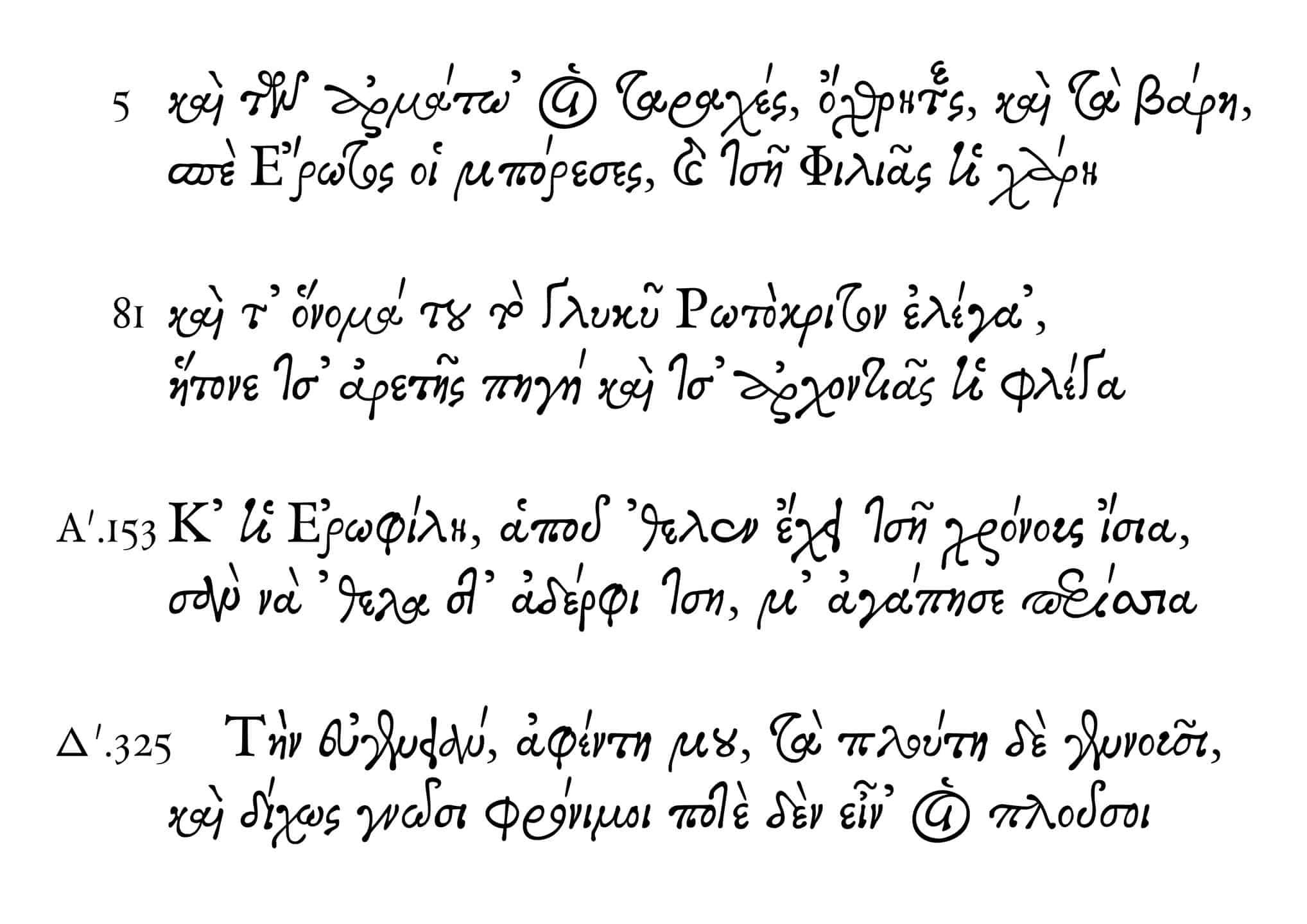
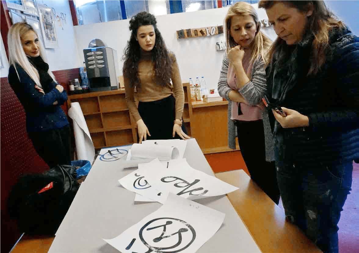
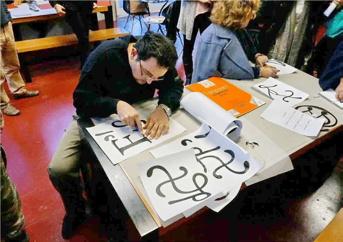
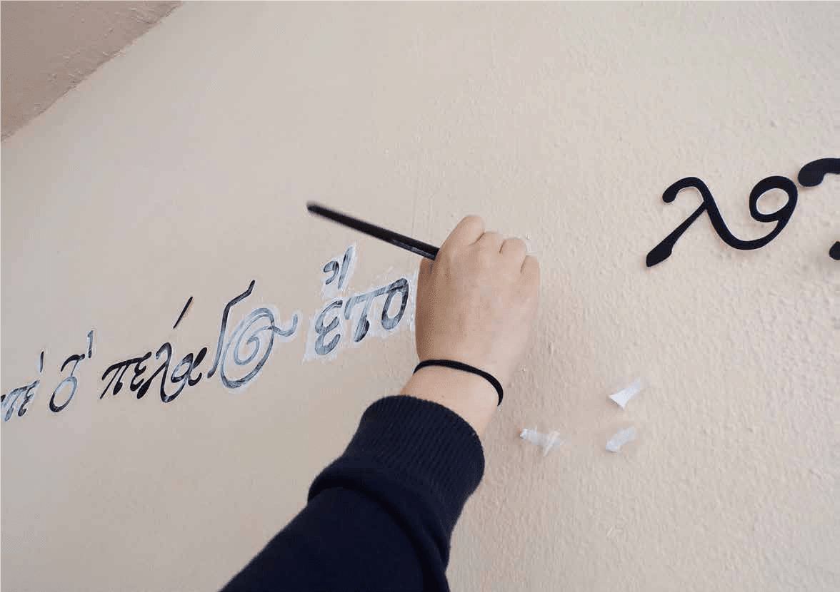
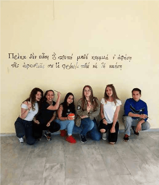
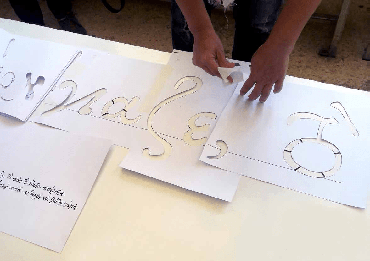
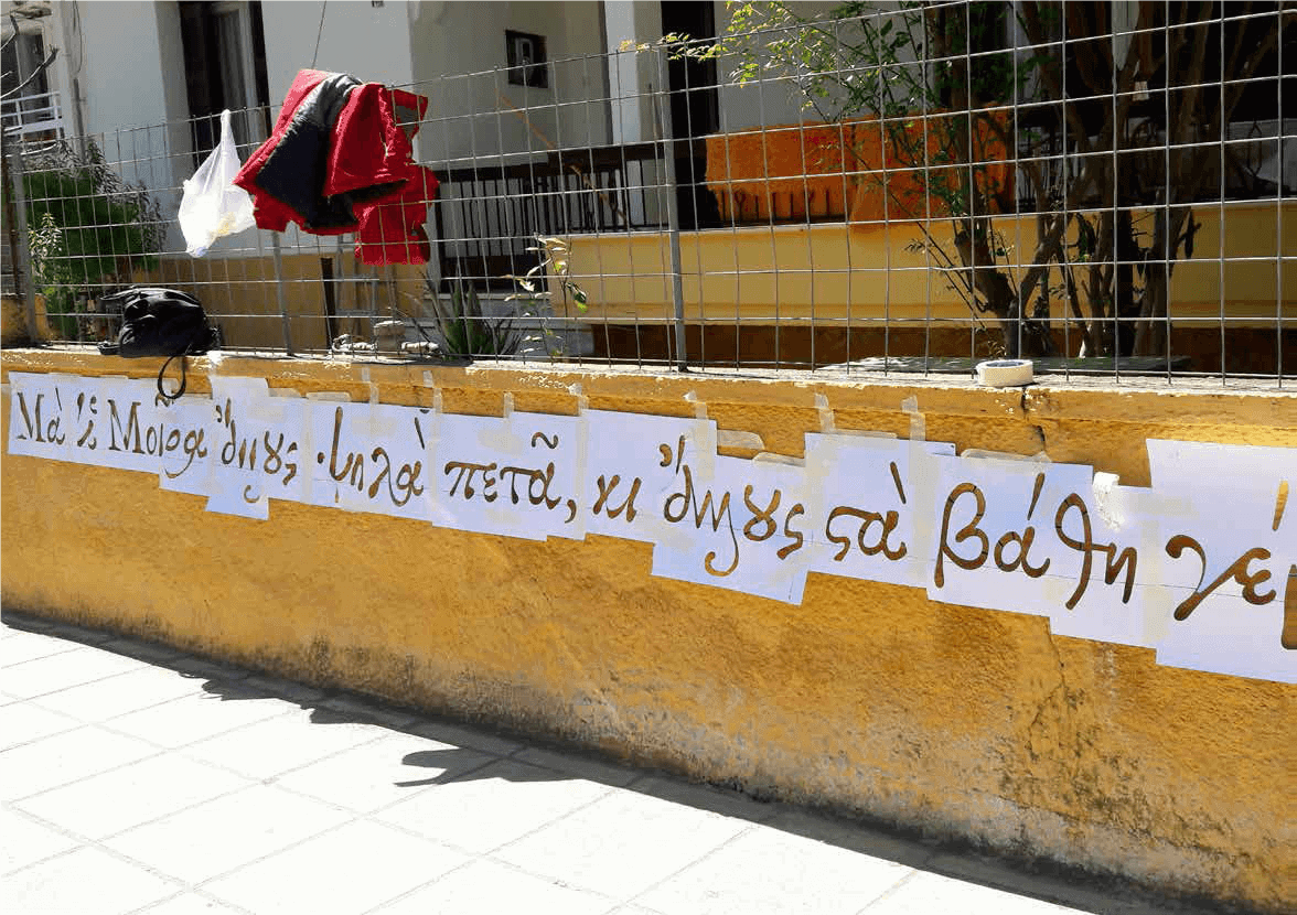
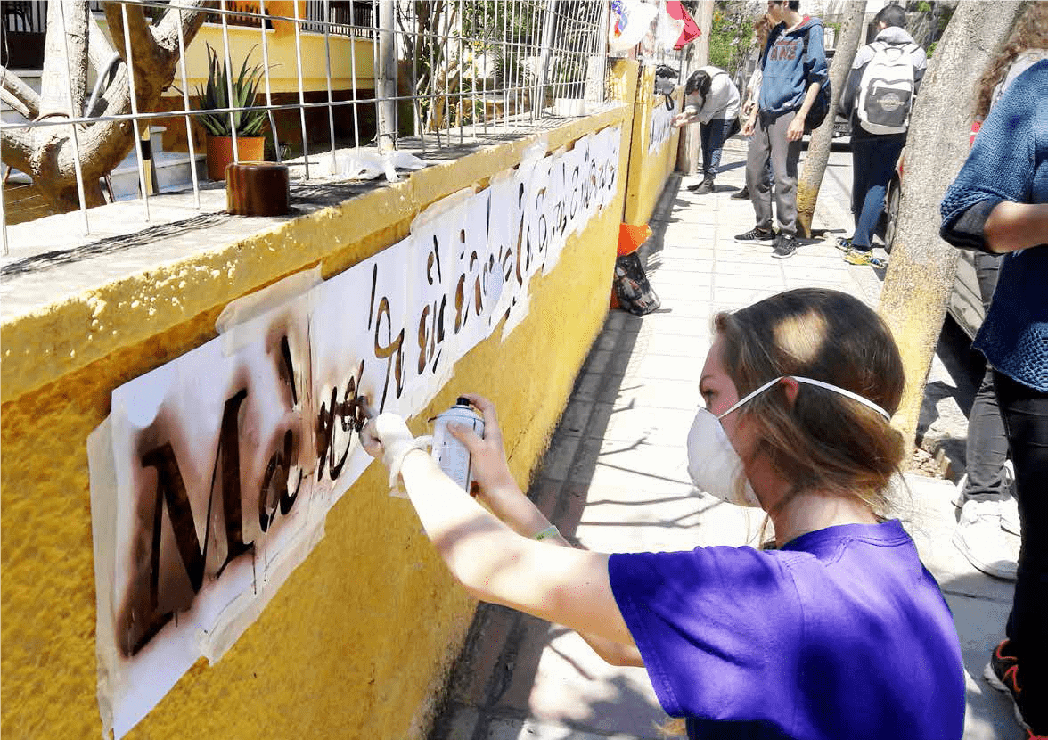
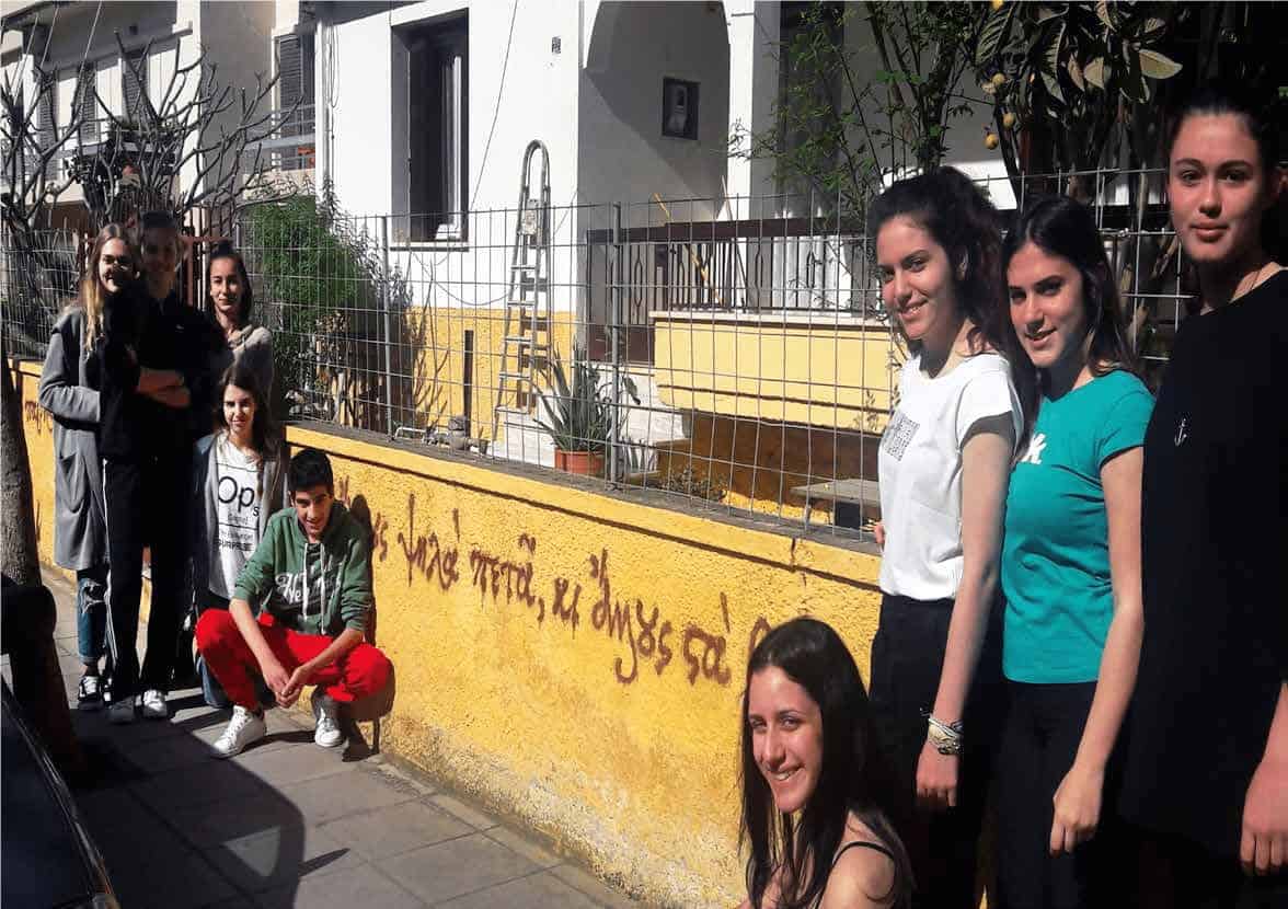
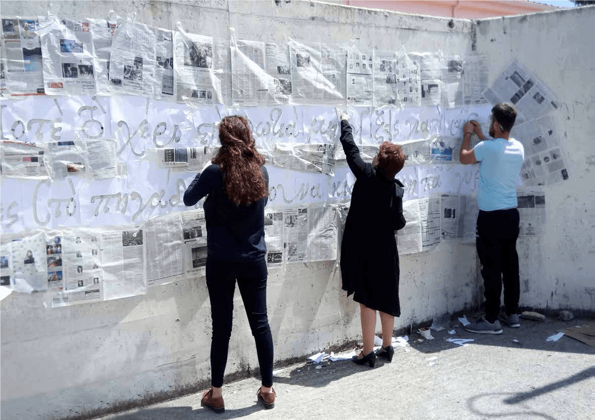
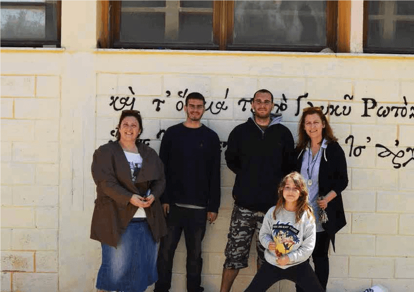
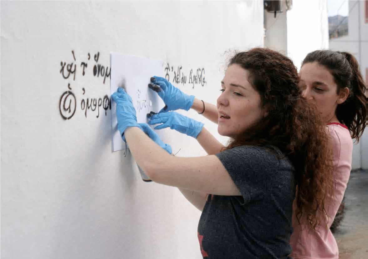
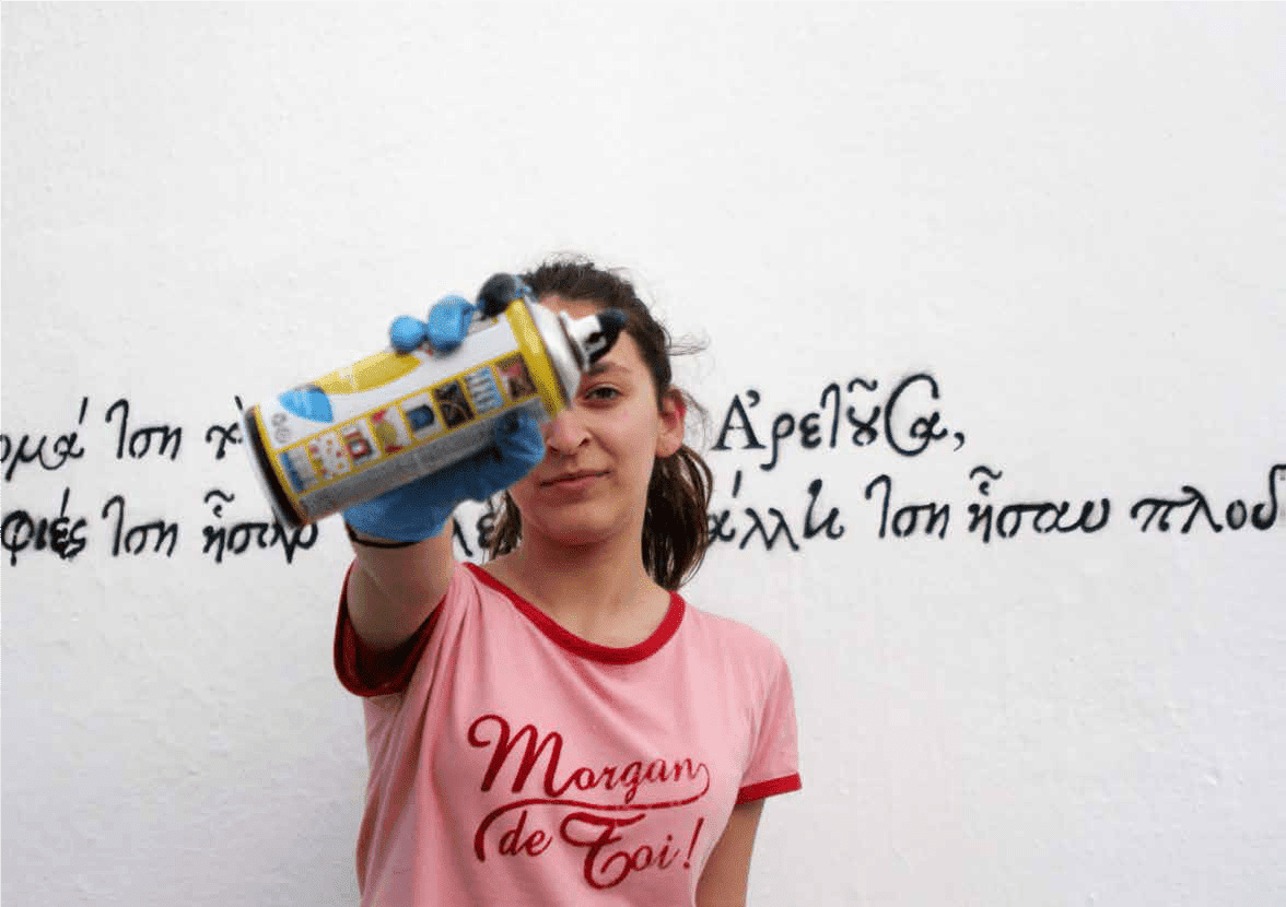
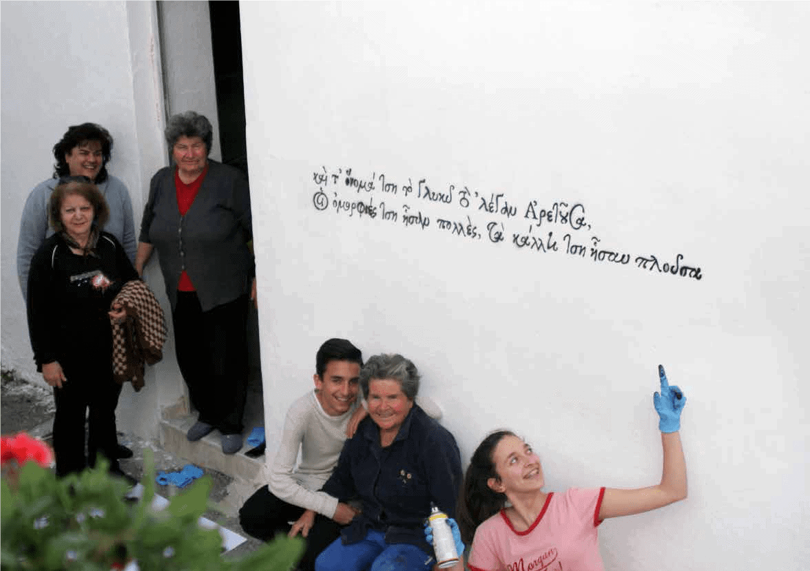
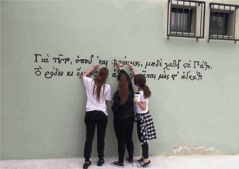
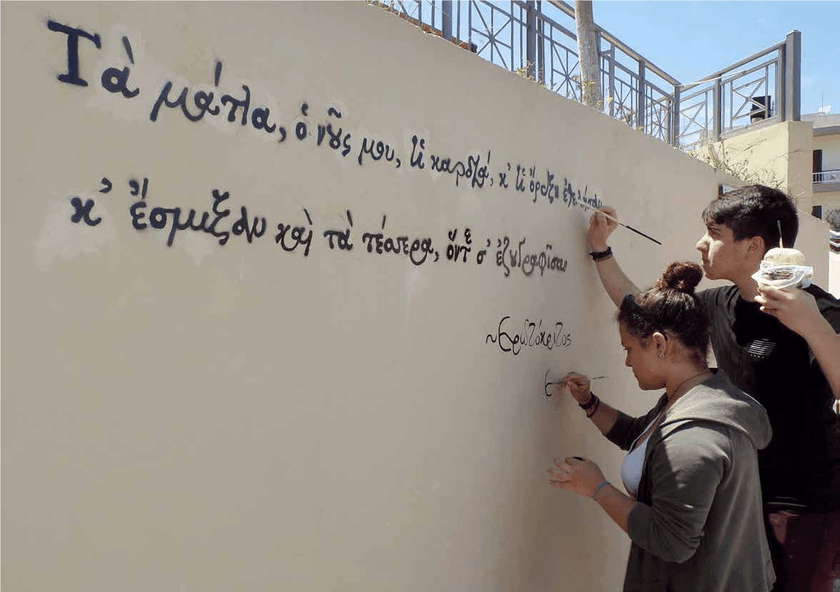
It is this “discrepancy” in the Greek printing continuum that my “type-artistic” proposition attempts to redress. A “what if” scenario to be re-introduced today in a way that Cretans will reconnect with a glimpse of their past: Therefore, “what if” these two Cretan poems of high artistic quality had actually been composed and printed using the best Cretan calligraphy-come type of the same period: the Grecs du roi? In addition, I concluded that a mere font replacement in the verses for a new edition of the poems would only be of interest to a small circle of print enthusiasts, but leaving the general public unaware. Searching for a formula to communicate to a wider scale the artistic synergy of two great Cretan achievements, I sought the help of my Cretan students at the Department of Graphic Design in Athens and the cooperation of the Secondary Education Authority in Crete. My idea was that teachers and pupils throughout Crete should be exposed more to the cultural achievements of their forefathers in meaningful and creative ways. What if they would organize in groups of volunteers and paint several stanzas of the two poems as Street Art in their schools and neighbourhoods. My proposition was enthusiastically adopted by Areti Marmataki, Artistic Coordinator of the Chania Secondary Education Board, who along with the Chairman, Stylianos Zervakis effectively secured the official approval from the Ministry of Education. She and a team of dedicated teachers have created the administrative network necessary for the operation. In January, a short seminar and a workshop were organized in Chania, hosted at the Printing Museum, where teachers from many cities and some local pupils came to learn about Greek printing history, the goals of the project and to be acquainted with graffiti and other techniques for Street art. Several of my Cretan students in the Department of Graphic Design at the Technical Educational Institute of Athens, under the energetic direction of Olga Bitsaki, formed the group “Typotropion” and operated as volunteers with the local schools of the island providing artistic and technical support. In effect, we have created several school groups in the four major cities of Crete: Chania, Rethymnon, Iraklion, and Sitia; during April and May 2017 the pupils have started canvassing their cities creating stanzas on many walls and common areas. The project will continue to operate over the next academic year and we hope that it will bring the Cretan poetry and typography back to the local communities in an alternative artistic recreation of their past.