The outside starts inside. Bookbinding experiences in Frankfurt and Offenbach.
Text of a paper given by Stefan Soltek at the conference of the Association of European Printing Museums, After printing: bookbinding as cultural heritage, Imprenta Municipal – Artes del Libro, Madrid, (Spain), 24-26 May 2018.
Stefan Soltek, Klingspor Museum Offenbach
To begin with I want to explain my personal situation which allows me to talk about bookbinding. I have no experience as a binder or book restorer but only my work as an art historian in the collections of two museums: the museum of applied arts in Frankfurt (Museum für Kunsthandwerk, now Museum Angewandte Kunst) during the 90s; and since 2002 in Offenbach at the Klingspor Museum. Frankfurt was my first time working as a curator. I was in charge of the Linel collection for book art and graphics. This most selective collection (around 15 books of hours, some 700 alba amicorum (sixteenth to nineteenth centuries), early prints, ornamental graphics from the fifteenth to nineteenth centuries) would be a wonderful resource by itself and could easily fill a talk about bindings.
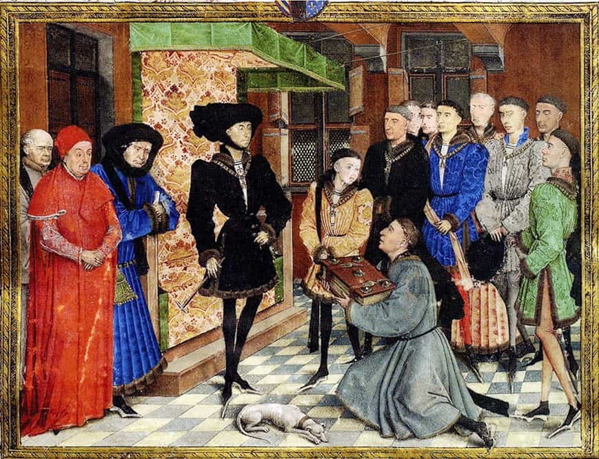
The first example I would like to evoke is neither from Frankfurt nor Offenbach, however, but from the Kings Library in Brussels: the famous miniature from the Chronicle of Hainaut, a translation of the Latin text into French by Jean Wauquelin. The miniature was executed possibly by Roger van der Weyden in the middle of the fifteenth century. The picture shows the moment when the translator Jean Wauquelin presents the book to Philip the Good who, as the Duke of Burgundy, had commissioned him to make the codex, and who now dedicated that treasure as a symbol of his power. For Philip, who had acquired that very territory – Hainault – the book dealing with its history is the foundation of the contemporary act to rule the country. The book, strong by its binding, built almost like a castle, has a clear political impact.
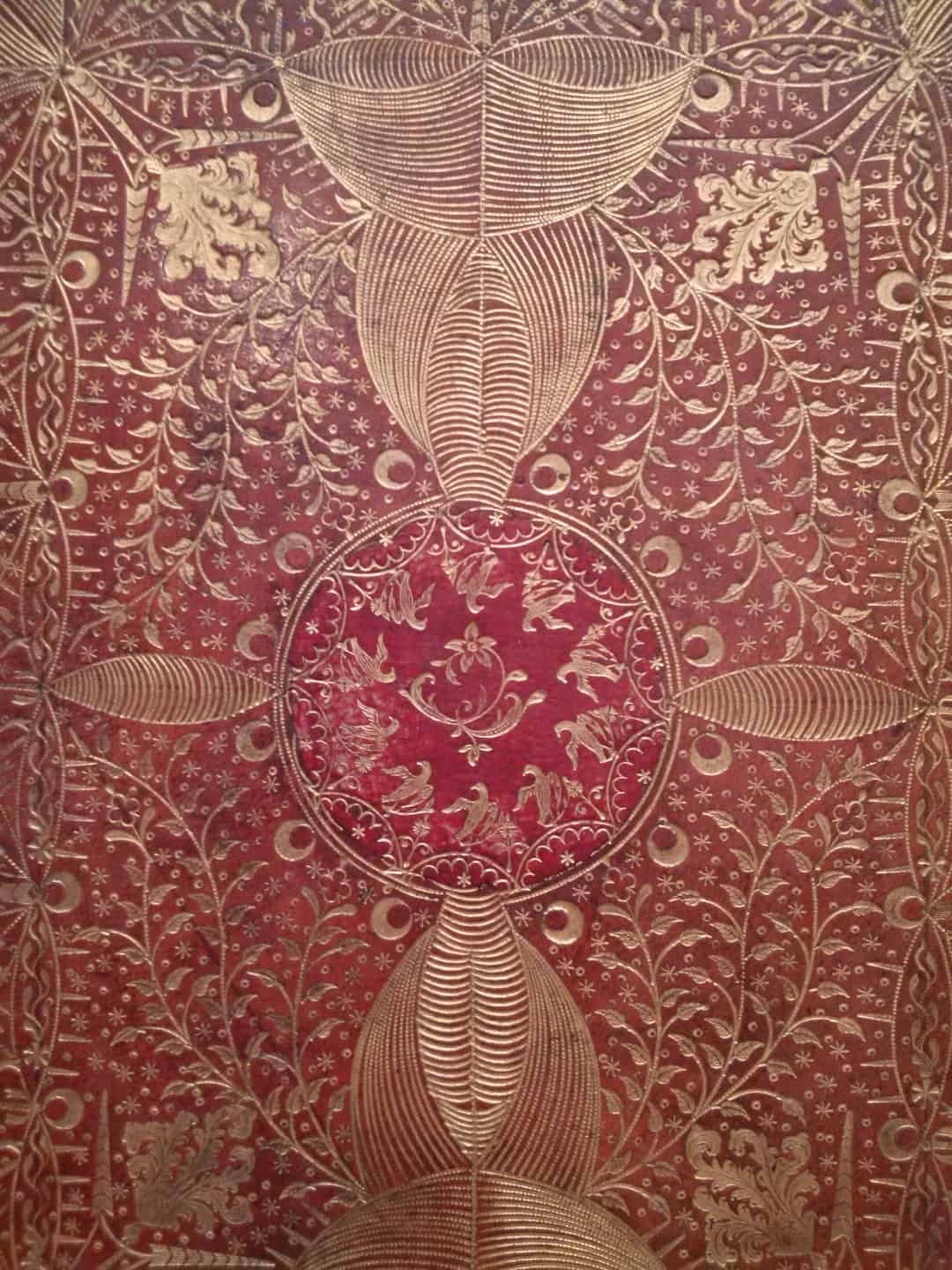
In fact it was my predecessor at the Museum für Kunsthandwerk, Eva Hanebutt-Benz, who grouped together the best bindings in the collection, running from books of hours to volumes of the art nouveau period. All sorts of bindings – mostly using precious leather and leather mosaics – are to be found in the collection. The catalogue of her 1987 exhibition was entitled Das Gesicht der Bücher in which the book I am coming to now is mentioned as Cat. Nr. 41, Ireland, around 1760. It is described as a red morocco binding with rich gilded ornamentation. The front and back covers are identically composed, showing a circle in the middle.
One day in 1992, by which time I had been the responsible curator for several years, I was contacted by Joseph McDonnell from Dublin. He had come across Eva Hanebutt-Benz’s catalogue and discovered the Irish volume. Soon afterwards, the National Gallery in Dublin would ask for it on loan.
Sure, I had seen the book before. Nothing much of interest inside: The orationes by Greek politician and speaker Demosthenes (Abb. 1-2). Yes, I had noticed the fine details of the gold ornamentation on reddish leather. But now I learned from the colleagues in Dublin that the book showed one of the best examples of the work of the so-called Parliament Binder B. Two craftsmen, Binder A and Binder B – for a long time not identified – represented the special quality of fine craft in bookbinding in the 18th century, a period of thoroughgoing wealth in Dublin, the extent of which had been demonstrated by the richness of house building and many other crafts.
Bookbinder B turned out to have a name, Edward Beatty, and the book which is considered to be the very best example of his work is to be seen in the March Library in Dublin. The Frankfurt item is very close to that one in quality, with similar forms of gilded ornamentation all around the covers representing goose feathers.
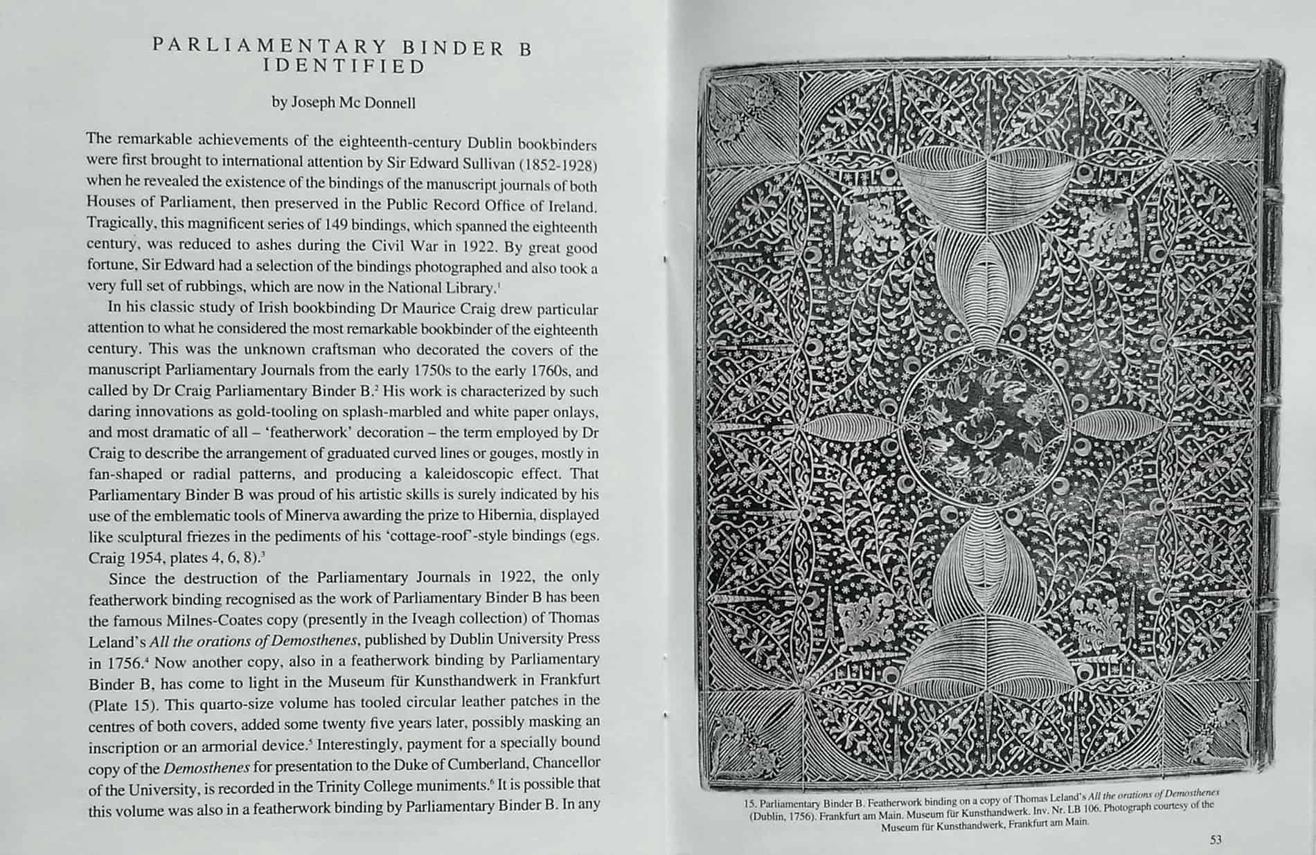
J. McDonnell wrote an article entitled ‘Parliamentary Binder B identified’ in the Bulletin of the Irish Georgian Society 35, 1992/93, a copy of which I was lucky enough to obtain only a couple of weeks ago, when preparing this talk. In it I discovered that Joseph McDonnel had put a note about his visit to our Frankfurt collection, mentioning me personally as a helping hand in his studies (polite as the mention is it is something of an exaggeration, but it very usefully strengthens my memory of the circumstances). In his text, illustrated by a black and white picture of the Frankfurt piece, McDonnell explains that the collection of roughly 120 bindings which were produced for the Irish Parliament, were lost in a fire fire during the 1922 Civil War. But photographs had been taken.
Anyway, in 1997, McDonnell would publish Five hundred years of the art of the book in Ireland: 1500 to the present to accompany an exhibition at the National Gallery of Ireland in Dublin, an exploration of bindings, illumination, calligraphy and title-page design of Irish printed books and manuscripts from the last five centuries. Given the richness of this chapter in book culture, and then finding the Frankfurt binding on the cover of the catalogue, you can understand the importance of the piece for the study of the history of Irish bookbinding and the pride of the Frankfurt museum in having the book in its collection; even if it is unable to say how the book made its way into the collection.
It should of course be added that following on Joseph McDonnell’s work, two other bindings underline the relevance of the work in the Frankfurt collection. One is to be found in Marsh’s Library, Dublin and comes with the same text as its sister-piece in Germany – the speeches of Greek politician Demosthenes – exhibiting the same fine quality in its sophisticated composition of gilded ornaments. The second is to be found in the famous Chester Beatty Library. Here the style of the spine is similar to that of the two other books but the cover is not. Or to be more precise, there is a strict contrast between the red leather of the ground and the gilded ornaments. A couple of the finest golden lines swing around the middle of the area and might give the impression of a precious look. At any rate the technique of the ornamentation of utmost preciseness and the featherlike form of the ornamental lines speak a clear language indicating that the books in question stem from the same craftsman.
I would like to evoke two more bindings from the Frankfurt collection as a bridge to the bindings in Offenbach which are of a far more recent period.
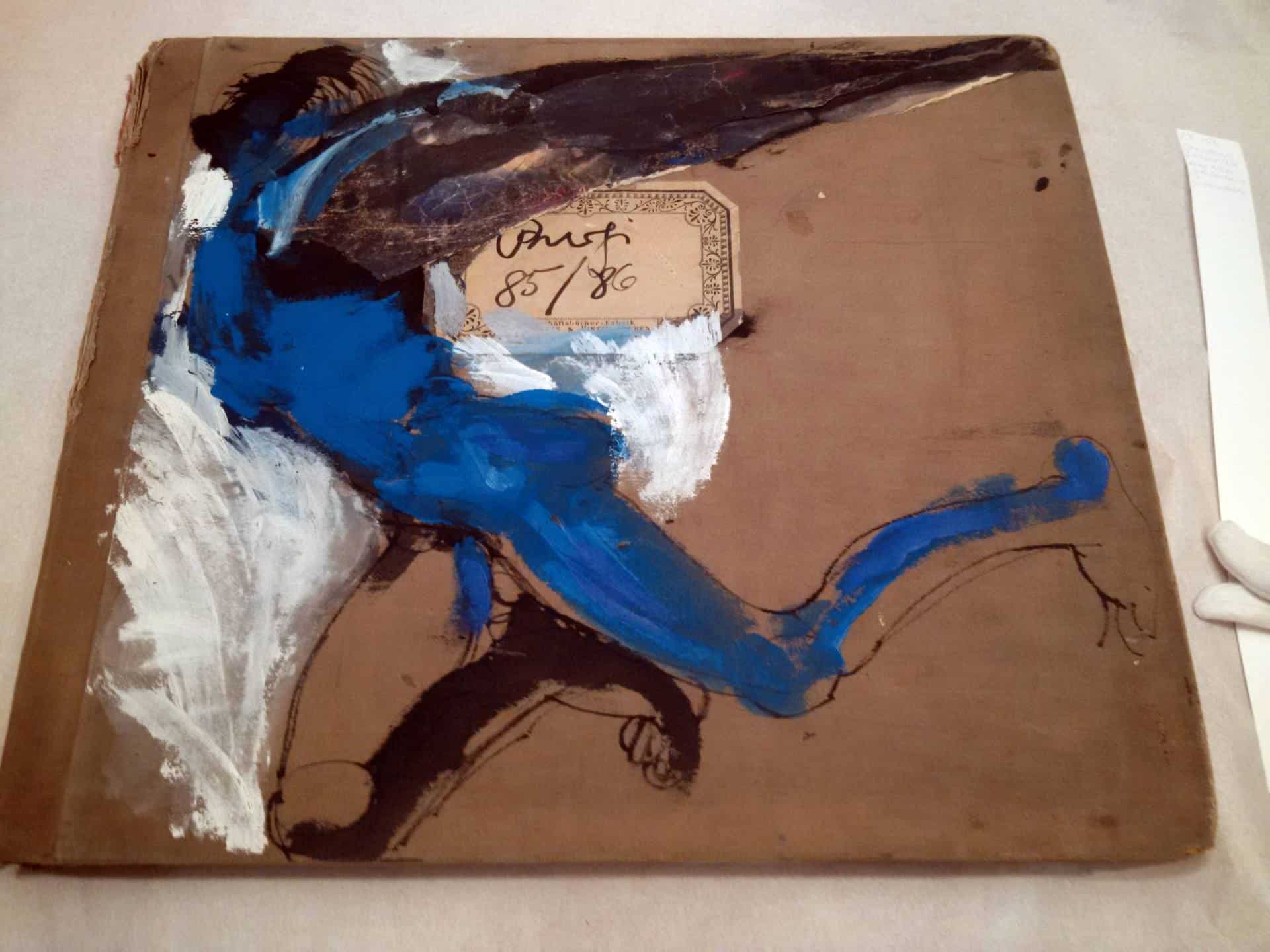
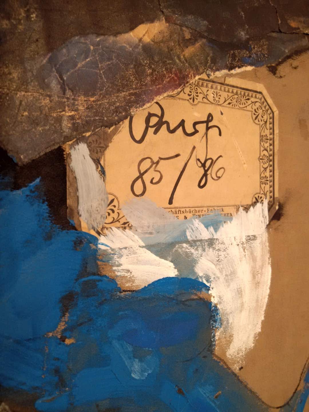 Burgi Kühnemann (born 1935) is the wonderful and powerful painter who mesmerized the young curator that I was when I got to know a large sketchbook. Burgi would have touched the badly faded grey-brown textile of the binding of an old account book from the late nineteenth century with a strip of paper to modulate the dark wing of vivid runner crossing the bookcover. Like a Hermes or an angel-like being the almost Yves Klein bluish figure bursts out of the area of the cover as if it were definitely too small. The spontaneously added white chalk underlines the atmosphere and the old lable, now showing Burgi 85/86 on the figure’s rear still ignites my fascination for Kühnemanns ability to fill a book’s appearance with dynamism and momentum. How better could a binding be made an invitation to discover the interior.
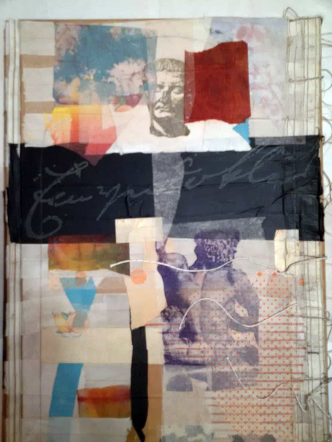
Also strong in its powerful setting is the huge book done by Robert Schwarz (born 1951) desgned to provide a setting for Friedrich Hölderlin’s Empedokles. The drama presents the philosopher being unsuccessful to lead the people of Agrigent the political way he would find suitable. Schwarz covers the immense volume of the book (filled with his lithographic arrangements) with a mosaic of pictures and fragments of material. The material used is essentially silk from a parachute and serves firstly to give the book a mysterious atmosphere, and perhaps second to hint at the end of Empedokles as he falls down into Etna.
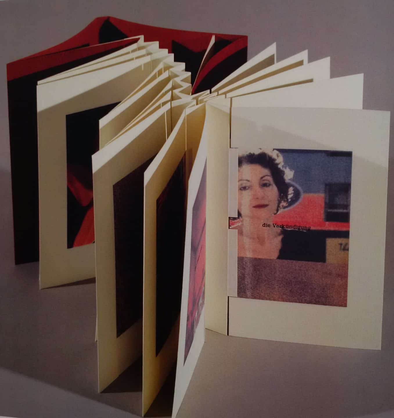
Coming now to the Offenbach collection, I would like to start with Karin Innerling (born 1942) – a brilliant book maker whose bindings benefit from her knowledge as a fully trained architect. The everlasting change represented by the opposition of a woman and a garden is the matter of the book shown here. The text was written by Swedish author Marie Lundquist. Innerling is well-known for her delicate book work. The clearer her decision to favor the modesty of her books becomes – small rather than large – the more evident is the care which she takes with every aspect of her artwork. A quite organic attitude meets with the preciseness of buildings which are to be seen in all of Innerling’s books.
Change (Verwandlung) is animated by a step by step concept. The pages are folded and mounted as a concertina binding. The spine of the book is very difficult, scary like the human spine which is so flexible, so strong and yet so sensible. By opening the book the reader kind of floats through it. The pictures have to cross the spine and make evident how much their message depends on it, dividing the sujets and yet holding them together. The growth and the loss of existence, ripeness and vanity are delicately expressed by the tactile binding.

One of the many surprising treasures coming out of the workshop of Veronika Schäpers is called Triumph eines Hosenverkäufers (Triumph of a trouser salesman). Before describing it, the artist has to be introduced, for she is one of the finest creative persons in the field of artist books. She was born 1969 in Gescher. Having passed her Abitur 1988 she started her studies at Burg Giebichenstein, Halle. This place is extraordinary as it is the only school that offers a proper diploma in the artist’s book. The education hints at both the technical processes of graphics and on binding. Following the great binder Mechtild Lobisch, Sabine Golde of Leipzig teaches her students about the development of personality in matching with the book’s characteristics, stimulating the capacity of the adventure of brain and spirit. Schäpers, one of the most impressive graduates of the school, went on with her studies at the Centro del libro in Ascona, and in Japan where she found a second home. All that helped her to sharpen her profile when dealing with the materials of bookmaking.

The book Triumph of a trouser salesman is an early work, dating from 2002. It was produced in an edition of fifteen copies. The book contains text and images inkjet printed on clear polyethylene foil pages. The pages are held together with elastic bands that also bend the cover. It is housed in a clear polycarbonate cover housed in an inflatable air-cushion with red titling on the front and black titling on the back, the whole housed in a white fleece bag.

Behind this sheer listing of the material facts we have to imagine the situation: Schäpers is confronted with a poem by Heiko M. Hartman, a German writer from Würzburg (1957). His plot is the dangerously overheated atmosphere between two men. One energetically tries to sell a pair of trousers. The other one energetically tries to reject the seller’s offensive. And here we get to the very moment of inspiration: Veronika Schäpers imagines the clinch between the two men to appear like the fight of two boxers. This alone, so nice a link, could make up a traditional book of the text and the illustrations of boxers. Not so when Schäpers gets to work on it. She wouldn’t illustrate the text in the book but rather build the very book intelf in form of a boxing ring.
Now we understand the making of the book. Each of the foil pages is folded at the end. These folded bits lie one on the other so the fold of the pages gets thicker at the spine then at the front edges. This spacy attitude gets intensified by the curved foils which form the covers. And it is the use of the elastic bands that reinforce the effect. The result is that these decisions on the physical appearance of the book – which go far beyond of a usual codex – go together with the inner design of text and color. Each of the foils takes only one line of the text, and from page to page each following line goes down the page by one step. So you read the text from top to bottom when flipping through the pages. The spots of color act in the same way and only when you look at the closed book do you recognize the faint profile of the two boxers.
The importance of the details lies in the brilliant conception of the book a perfect unit. Especially when you approach the work with it standing vertically it immediately turns out to function as a location as part of the message which includes the idea, the words, the visualisation. The binding does not just hold the book together, but is the book itself and can be touched as part of the unfolding of the story. Or it might be better to say that the story gets adapted to a new existence, of a mixed media message which may be the book, but in fact is the congenial equivallent to both the author and the reader. And those both find themselves – so to speak – in the authority of the artist, Veronika Schäpers.
The book is inspired by Heiko Michael Hartmann’s poem and when it is first viewed it looks like blurs of red, the text becoming lighter as you descend to read it. But, as you turn the first page, you realize that the red is a silhouette of two boxers fighting, the lines of the poems appearing one at a time on each page. So, as you turn the pages to read the text, you see the two boxers continuing their bout. But what does boxing have to do with selling trousers? The poem, which is in German, is written from the salesman’s point of view, who approaches the job as a boxing match.
Corinna Krebber came to our museum in 2009. She introduced herself as a university-trained architect. But instead of entering a career in this field she decided to follow her vocation as an artist. In fact she is one of the most surprising artists combining architecture, book and the installation of written words. In her way of thinking binding may be kind of healing by linking the words, or the letter like movements of her cutting in paper. When she made a group of handicapped youngsters reflect on the terms connection, meeting, discovering, internet… they followed her idea to cut out textlines from paperbacks and let them form a network.
The basis for this was a project which involved a small number of paperbacks which share the issue of the experience of time and space: such as Thomas Bernhard’s famous ‘walking’ or Marcel Proust’s ‘lost time’ or Max Frisch’s ‘Diary’. Krebber took a cutter and carefully eliminated every bit of their text. This kind of reading destabilized the book-body and she would save the somewhat deconstructed construction of the pages in simple grey cardbord jackets.
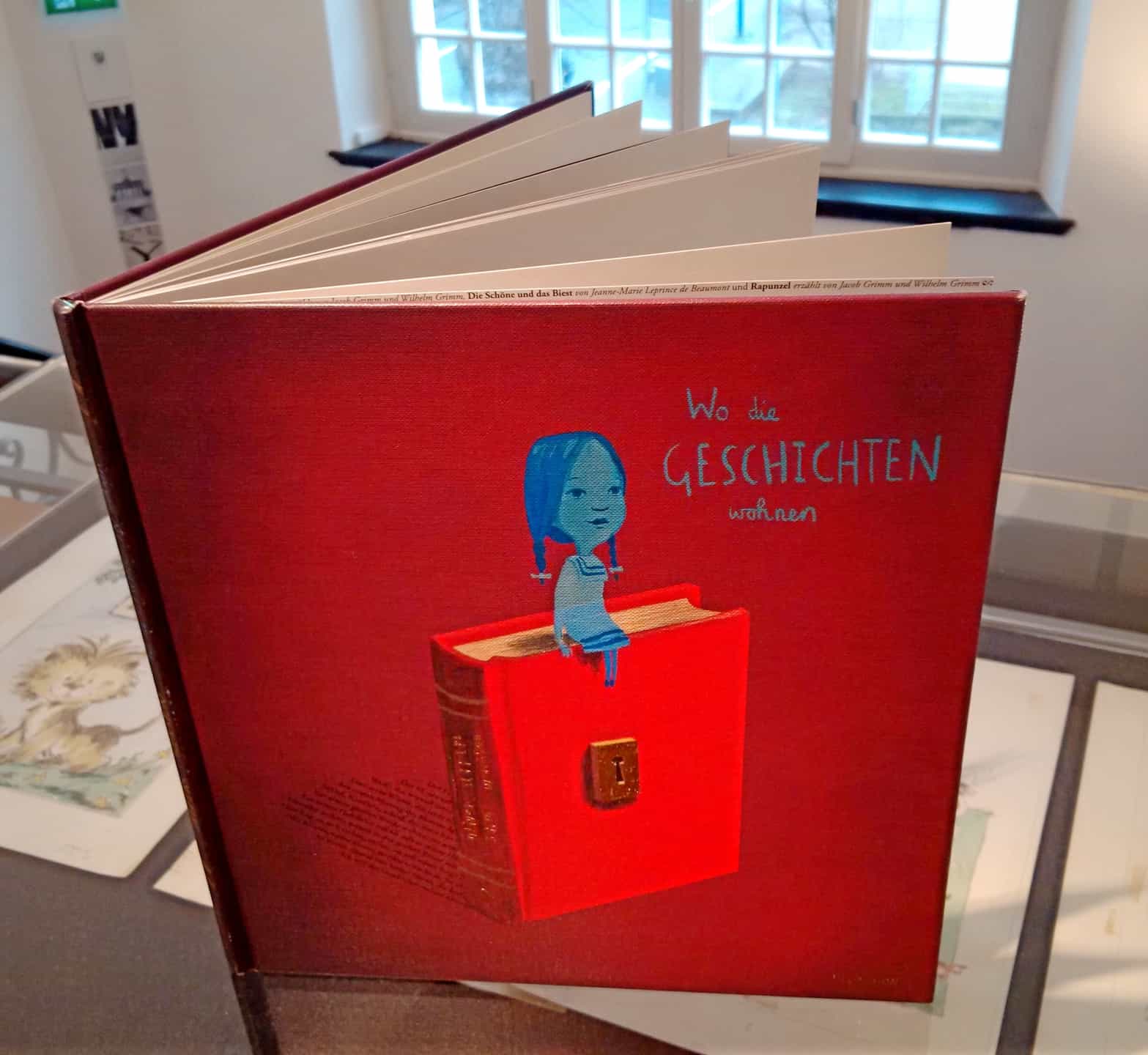
A child of books is a childrens book by Sam Winston and Oliver Jeffers, a beautiful, poignant and timely manifesto for the myriad rewards of reading and sharing the enjoyment of stories.
From New York Times bestselling author-illustrator Oliver Jeffers, creator of The Day the Crayons Quit and Lost and Found, and typographical artist Sam Winston comes an exceptional new picture book. I am a Child of Books. I come from a world of stories, And upon my imagination, I float. In this inspiring, lyrical tale about the rewards of reading and sharing stories, a little girl sails her raft ‘across a sea of words’ to arrive at the house of a small boy. There she invites him to come away with her on an adventure. Guided by his new friend, the boy unlocks his imagination and a lifetime of magic lies ahead of him… But who will be next? Elegant illustrations by Oliver Jeffers are accompanied by Sam Winston’s astonishing typographical landscapes,….. (See: http://www.walker.co.uk/A-Child-of-Books-9781406358315.aspx and also dialog of the artists: http://blog.picturebookmakers.com/post/149741346681/oliver-jeffers-sam-winston.)
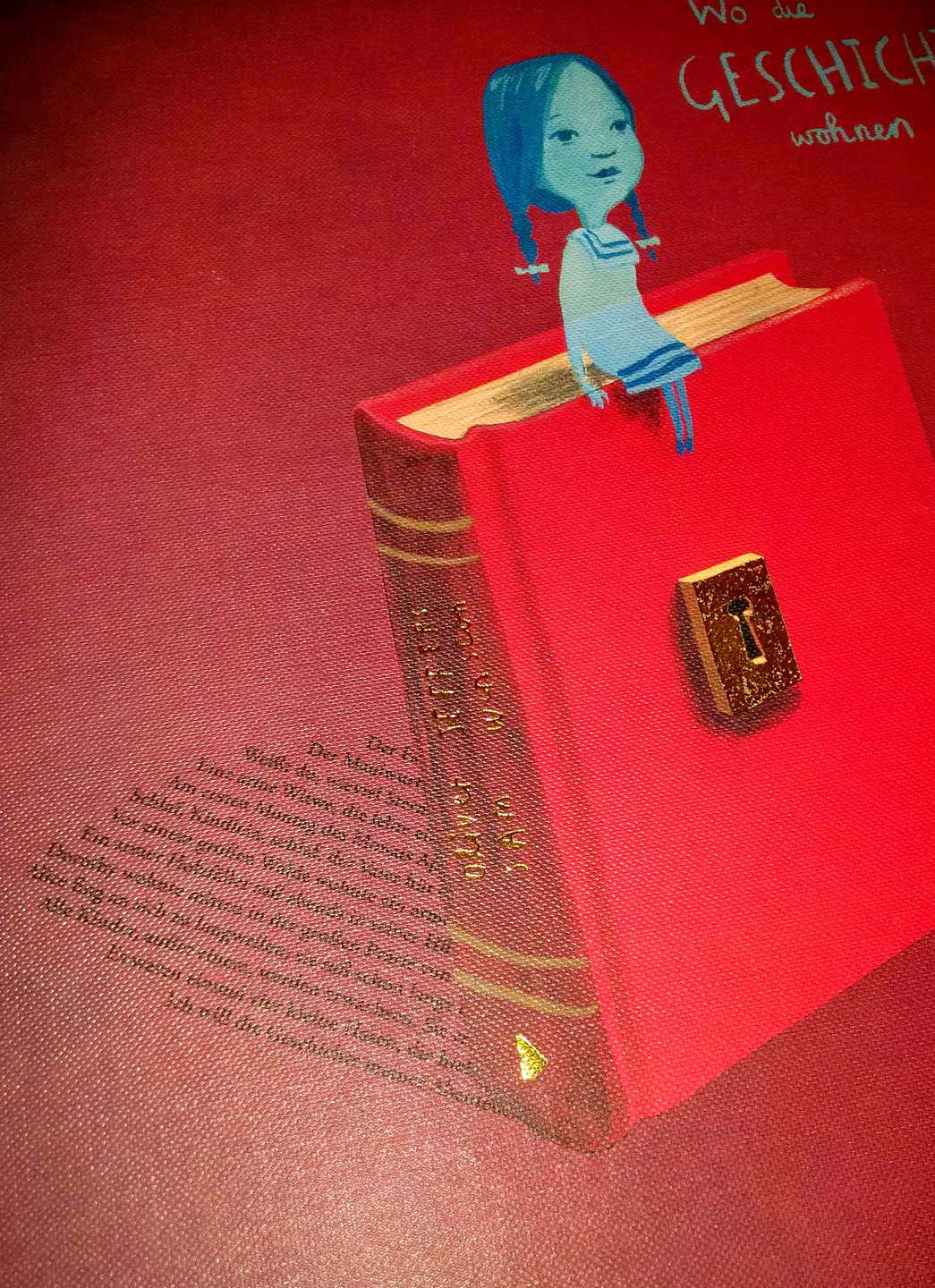 The binding is of no spectacular interest but the cover design is. On top of the actual book, right in the middle we are shown to a book with the girl, one of the protagonists, sitting on its upper edge. Being outside the book she only can get inside if she is able to unlock the golden lock that is fixed on the very centre of the book. Combined with the shadow of the book – typographically shaped titles of famous historic children books – the book with the girl sitting on it and the thick lock the cover gain a sort of step-by-step relief, stimulating our wish to touch and to open up the actual book. The key to open the lock is hidden on the back cover. So all this has a logical yet easy way of driving us carefully to and into the book. Because the book itself is the matter of the book, the trees in the fairy forest, in the center of the plot and book are designed like books, seen from the front edge.

The thing about this book is not only the story as it is told, but also the underlying meta-code: the phenomenon of telling and of the book in general. It is the act of linear movement which teaches young people that it is enhancing to be aware of how to reach a process of intriguing and yet quiet presence from a start to a final aim. To that potentially never-ending flow of discovery the binding with the covers mark an organic portion. The unlocking, opening and shutting of the book offer a kind of calculation of the astounding procedure inside.
A nicer design could not be found to finish the book on a binding that corresponds exactly to what is both the plot and the strategy of the book. It turns out to be laid out as a perfect mosaic of items to project a wonderful book. Again, this piece makes clear that a well bound book is as convincing in the way it looks on the outside as the way it was conceived inside. The old traditional bookclasp finds a quite different, yet suitable renaissance.
In conclusion, bookbinding has multiple meanings. Especially when you take the German word which not only means the actual finishing of the codex between the covers. In German Einbindung also means involving and integrating. So the book as a matter of Einbindung act also as a means of creating participation.
The book – and it’s binding, including it’s covers – will always function as an object mediating between people, actors who confer upon it a special meaning and a special procedure. The book involves a specific content but it also, by its binding, forces the involvement of those who will deal with it.
Basic sources: Robert Schwarz: ‘O Ehre was Du nicht verstehst’, Friedrich Hölderlin, Empedokles, Mainz 1993; Burgi Kühnemann: Burgi. Buch-Akte, Museum für Kunsthandwerk Frankfurt am Main 1990; Karin Innerling: Karin Innerling, Buchobjekte 1984-2010, Klingspor Museum Offenbach 2011; Veronika Schäpers: Katalog ‘Entgrenzt’, Klingspor Museum, Berlin/Offenbach 2014; Sam Winston: Catalogue arc unbound, London 2013